7. Spectral Analysis#
Note
These (and most other) notes derive heavily from DelSole and Tippett’s fantastic textbook, Statistical Methods for Climate Scientists.
7.1. (notebook preliminaries)#
%matplotlib inline
%config InlineBackend.figure_format = "retina"
import matplotlib.pyplot as plt
import numpy as np
import pandas as pd
import scipy
import statsmodels.api as sm
import holoviews as hv
hv.extension('bokeh')
import panel as pn
pn.extension()


import puffins as pf
from puffins import plotting as pplt
# Make fonts bigger for slides
plt.rcParams['font.size'] = 16
import xarray as xr

# Load the data
filepath_in = "../data/central-park-station-data_1869-01-01_2023-09-30.nc"
ds_cp_day = xr.open_dataset(filepath_in)

# Clean: drop all 0 values of the temperature fields which are (mostly) spurious
for varname in ["temp_avg", "temp_min", "temp_max"]:
    ds_cp_day[varname] = ds_cp_day[varname].where(ds_cp_day[varname] != 0.)
ds_cp_mon = ds_cp_day.resample(dict(time="1M")).mean()
ds_cp_ann = ds_cp_day.groupby("time.year").mean()
tanom_dt_day = pf.stats.detrend(ds_cp_day["temp_anom"])
tanom_dt_mon = pf.stats.detrend(ds_cp_mon["temp_anom"])
tanom_dt_ann = pf.stats.detrend(ds_cp_ann["temp_anom"])
import numpy as np

def autocov(arr, lags=None):
    """Sample autocovariance of a 1D array.

    Assumes that the deterministic component, $\hat\mu$, is constant in time.
    """
    if isinstance(arr, xr.DataArray):
        vals = arr.values
    else:
        vals = arr

    num_vals = len(vals)

    if lags is None:
        lags = range(num_vals)
    if np.isscalar(lags):
        lags = [lags]
    lags = np.abs(lags)

    mean = np.mean(vals)
    covs = np.zeros_like(lags) * np.nan
    for n, lag in enumerate(lags):
        x_t = vals[lag:]
        x_t_lag = vals[:num_vals - lag]
        covs[n] = np.sum((x_t - mean) * (x_t_lag - mean))
    return covs / num_vals
7.2. Introduction to spectral analysis#
7.2.1. The basics#
In spectral analysis, we change perspectives regarding our timeseries.
Normally, we think of a timeseries as the combination of signals (values) occuring at different points in time.
In spectral analysis, we think of a timeseries as the combination of signals (amplitudes) occuring at different frequencies in time.
Each of these signals has a particular frequency (or, equivalently, period) and amplitude.
Spectral techniques can be applied to other dimensions too, such as location.
In that case, period (how long in time each cycle lasts) gets replaced with wavelength (how far in space each cycle spans).
That said, we’ll stick to time moving forward.
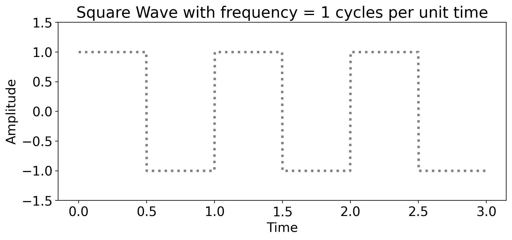
7.2.2. An example spectral decomposition: a square wave#
A square wave is, well, a wave that’s square.
Graphically:
import numpy as np
import matplotlib.pyplot as plt
from scipy import signal

# Parameters for the square wave
period = 1  # period of the square wave
amplitude = 1   # Amplitude of the square wave
periods = 3     # Number of full periods to display

# Time array
t = np.linspace(0, periods * period, 1000, endpoint=False)

# Generate the square wave
square_wave = amplitude * signal.square(2 * np.pi * (1/period) * t)

# Plotting
plt.figure(figsize=(10, 4))
plt.plot(t, square_wave, linestyle=":", color="grey", linewidth=3)
plt.title(f"Square Wave with frequency = {period} cycles per unit time")
plt.xlabel('Time')
plt.ylabel('Amplitude')
plt.ylim(-1.5 * amplitude, 1.5 * amplitude)

plt.show()
Mathematically:
where \(t\) is time, \(A\) is the amplitude, and \(T\) is the period.
The period is always the inverse of the frequency.
The period says “how long does it take to complete one cycle?” Longer period = slower cycle.
The frequency says “how many cycles are there per unit time?” Larger frequency = faster cycle.
Via spectral techniques (specifically Fourier analysis), we can approximate this as the sum of sine waves, each with different frequencies.
As the number of sines increases, the approximation gets better and better.
Here’s an awesome visualization of this from Wikipedia:

In fact, if the number of sine waves if infinite, then you get the square wave exactly.
This doesn’t just hold for the square wave: it holds for any function!
Like this sawtooth wave (animation via Wikipedia):

And this weird piecewise-defined function (via Wikipedia):

And, last but definitely not least, check out this drawing of Fourier himself generated via (complex) Fourier transforms, in a truly fantastic video by 3Brown1Blue: https://youtu.be/r6sGWTCMz2k?si=65rDzrkoa6_Z_seD
These examples have all been continuous, which is why you need the sum of an infinite number of sines to generate the original function exactly.
But all of the timeseries we analyze are discrete: there are finitely many values, each separated from one another by some finite amount of time.
For example, a year’s worth of cooling degree days from the Central Park dataset:
ds_cp_day["cool_deg_days"].sel(time=slice("1989", "1989")).plot(marker=".")
[<matplotlib.lines.Line2D at 0x16263d3d0>]
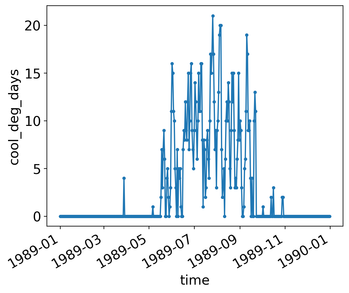
Even though we connect the individual points with a line, they are discrete: one value per day.
In that case, you don’t need infinitely many sines or cosines; you just need as many as there are points in time.
The formal procedure for doing so is Discrete Fourier Transform, which we’ll now dive into.
7.3. Discrete Fourier Transform#
Any discrete time series can be represented as the sum of sines and cosines of various frequencies and amplitudes.
This is called discrete Fourier transform, named after Joseph Fourier.
The mathematical derivation of Fourier transforms (whether discrete or continuous) is relatively straightforward, but it’s long and tedious enough that we’ll gloss over it.
Instead we’ll just go straight to the point: what it is, and then how to compute it in python.
7.3.1. Discrete Fourier transforms, formally#
Formally:
where \(X_t\) is the time series, and \(N\) is the number of timesteps.
The values \(\omega_j\) are the Fourier frequencies, defined as:
The values \(A_j\) and \(B_j\) are the amplitudes of the cosine and sine waves, respectively, at each Fourier frequency \(\omega_j\).
Technical note: the method computers use to do this is called Fast Fourier Transform (FFT).
FFT requires that the number of points, \(N\), be even. For odd \(N\), it just drops one value.
But what are the values of \(A_j\) and \(B_j\)?
Again, we’re skipping the derivation entirely, but it turns out that for the “interior” (meaning not the single largest or smallest frequency) these are:
and
The endpoints are special:
Do you recognize the RHS (right-hand-side)?
It’s just the time mean, \(\overline{X}\)! In other words \(A_0=\overline{X}\) always.
Finally, it turns out that \(B_0\) and \(B_{N/2}\) drop out, leaving just \(A_{N/2}\) remaining:
which looks like the time mean but flips the sign of consecutive values via the \((-1)^t\) term.
7.3.2. Discrete Fourier transforms, in practice#
For the purposes of this class, you can compute all these \(A_j\) and \(B_j\) components in python using scipy’s implementation of FFT:
scipy.fft.fft to perform the FFT
scipy.fft.fftfreq to compute the sample frequencies
Note
The Fast Fourier Transform algorithm implemented in scipy.fft.fft uses different conventions in terms of the indexing and leading normalization factors compared to the equations above. It also uses complex numbers. All of this results in a more efficient algorithm.
But as such, there won’t be a one-to-one correspondence between the exact values you would get by calculating the above equations by scratch vs. plugging your timeseries into scipy.fft.fft.
7.3.3. Some examples#
Let’s apply this to a series of simple examples.
First, we (meaning ChatGPT following my prompt) will generate a function that, given a timeseries, does the following:
computes the Fourier transform
plots the original timeseries
plots the amplitudes of each component
import numpy as np
import matplotlib.pyplot as plt
from scipy.fft import fft, fftfreq

def plot_time_series_and_dft(t, timeseries, title='Time Series and DFT'):
    """
    Plots a given time series and its Discrete Fourier Transform (DFT).

    :param t: Array of time points.
    :param timeseries: Array of time series data points.
    :param title: Title of the plot.
    """
    # Compute the Discrete Fourier Transform (DFT) using FFT
    fft_result = fft(timeseries)

    # Get frequencies for the components
    freq = fftfreq(len(t), d=(t[1]-t[0]))

    # Plotting
    fig, axs = plt.subplots(1, 2, figsize=(14, 5))

    # Plot the original time series
    axs[0].plot(t, timeseries)
    axs[0].set_title("Original Time Series")
    axs[0].set_xlabel("Time")
    axs[0].set_ylabel("Amplitude")

    # Plot the magnitude of the DFT
    axs[1].plot(freq[freq>=0], np.abs(fft_result[freq>=0]) / len(t), marker=".", )
    axs[1].set_title("Magnitude of DFT")
    axs[1].set_xlabel("Frequency (Hz)")
    axs[1].set_ylabel("Magnitude")
    axs[1].set_xlim(-1, np.max(freq))

    plt.suptitle(title)
    plt.tight_layout()
    plt.show()
Now, let’s apply it to a flat line:
# First generate an array of times that all of the subsequent timeseries will use.
t = np.linspace(0, 10, 400, endpoint=False)
# Constant signal
flat = np.full(len(t), 1)
plot_time_series_and_dft(t, flat, title='Constant Signal')
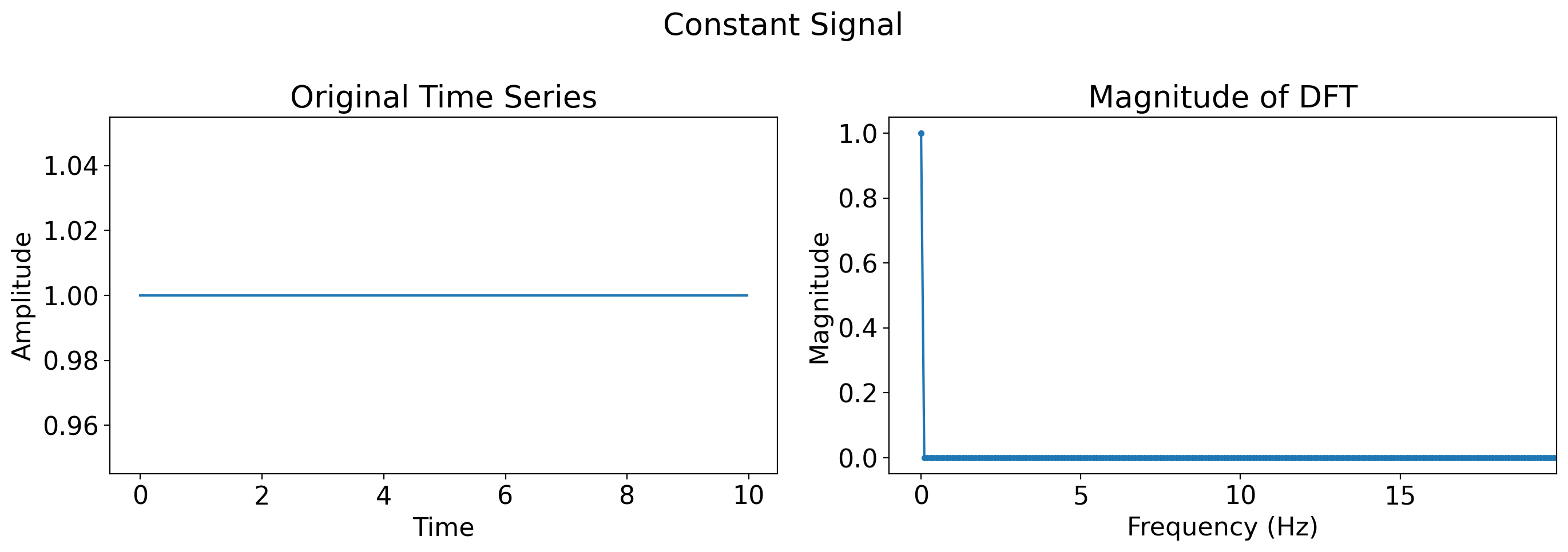
What do you see?
A flat line means there is no periodic behavior whatsoever. That means all of the power is in the frequency of 0.
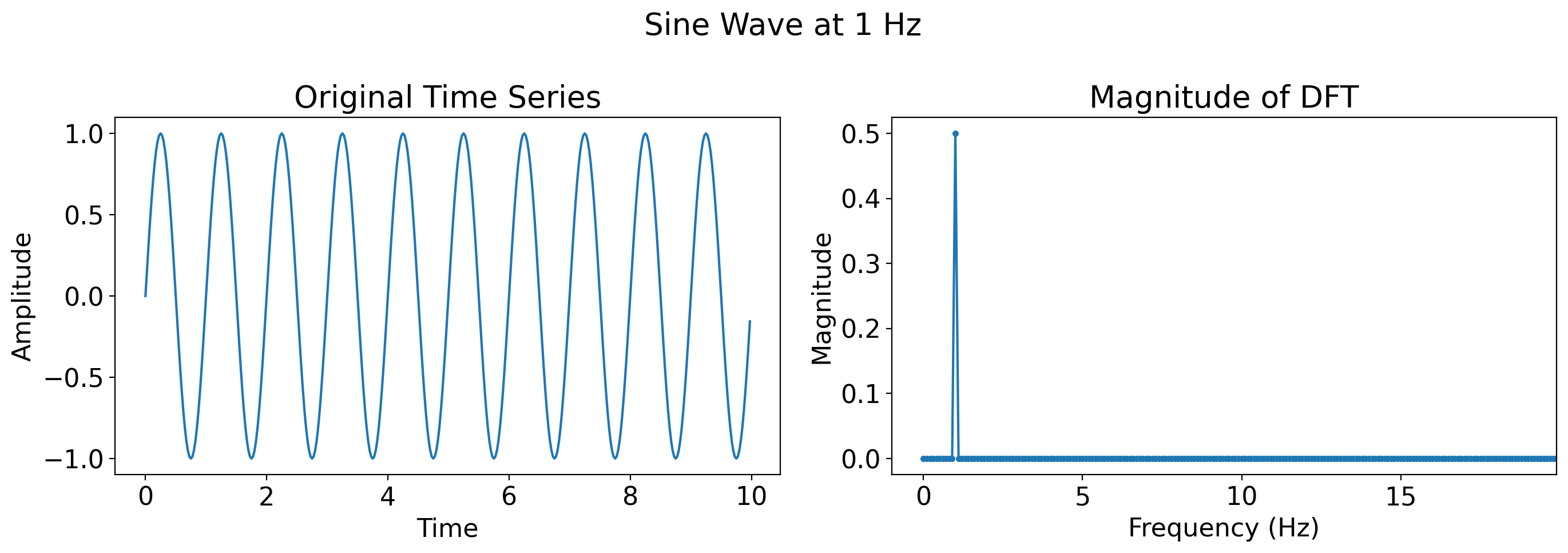
Now, a single sine wave with frequency 1 Hz (where Hz means Hertz, which is the standard units for frequency, and means “cycles per second”):
single_sine = np.sin(2 * np.pi * t)
plot_time_series_and_dft(t, single_sine, title='Sine Wave at 1 Hz')
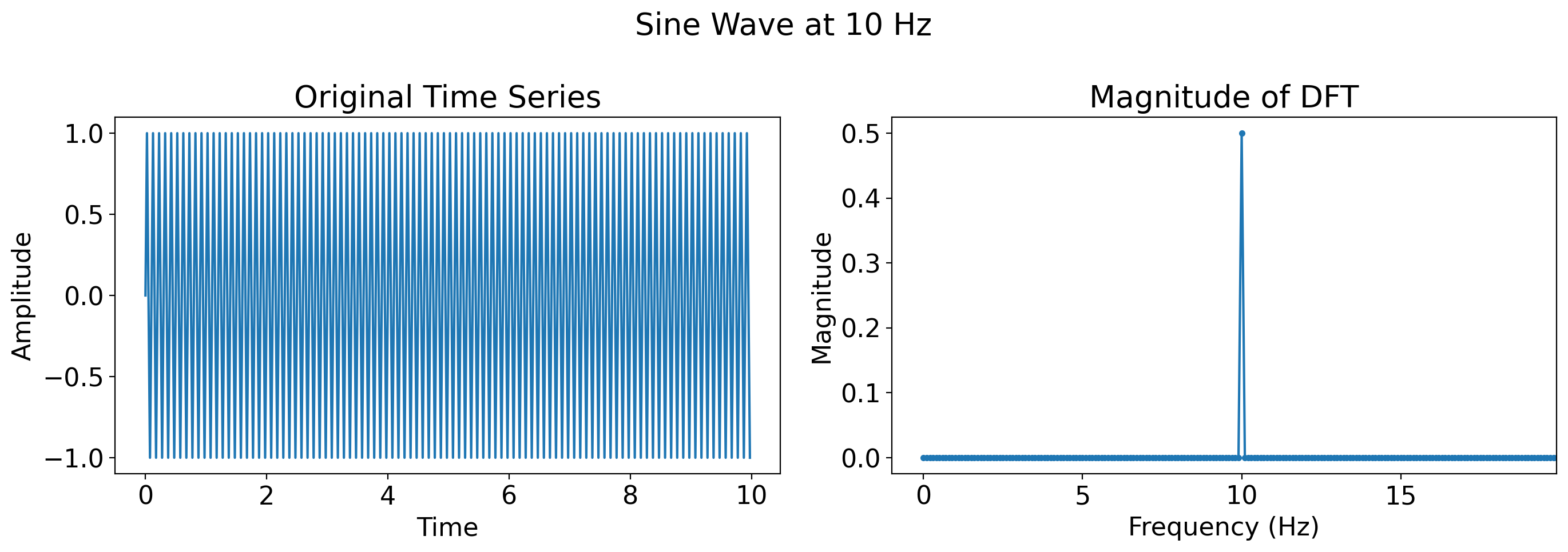
Now, a faster sine wave, one at 10 Hz
slower_sine =  np.sin(2 * 10* np.pi * t)
plot_time_series_and_dft(t, slower_sine, title='Sine Wave at 10 Hz')
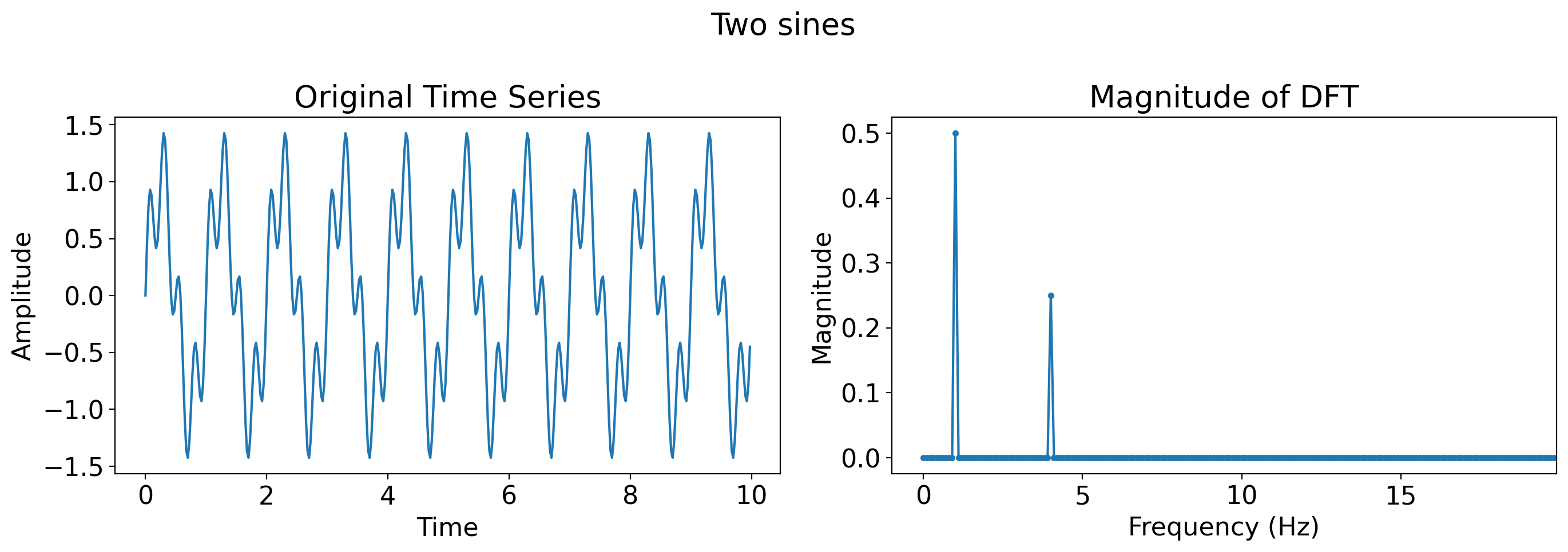
# Superposition of sine waves
two_sines = np.sin(2 * np.pi * t) + 0.5 * np.sin(2 * np.pi * 4 * t)
plot_time_series_and_dft(t, two_sines, title='Two sines')
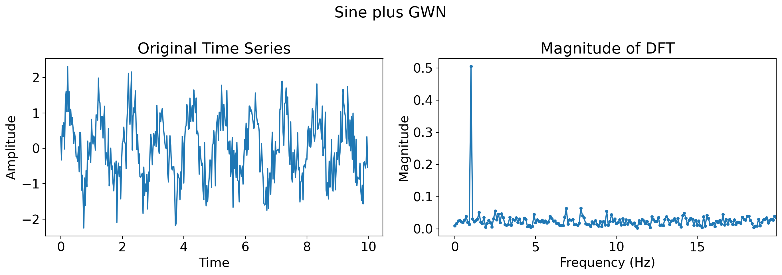
# Sine wave plus Gaussian white noise
sine_with_noise = np.sin(2 * np.pi * t) + np.random.normal(0, 0.5, len(t))
plot_time_series_and_dft(t, sine_with_noise, title='Sine plus GWN')
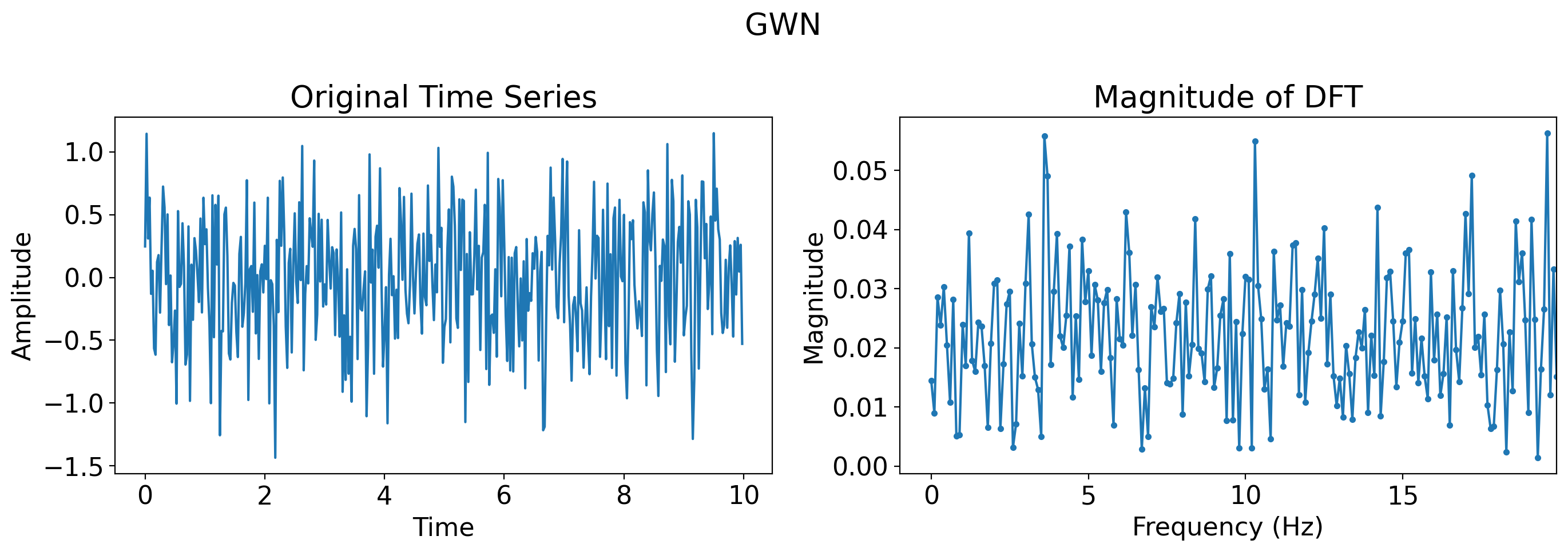
# Just Gaussian white noise
gaussian_white_noise = np.random.normal(0, 0.5, len(t))
plot_time_series_and_dft(t, gaussian_white_noise, title='GWN')
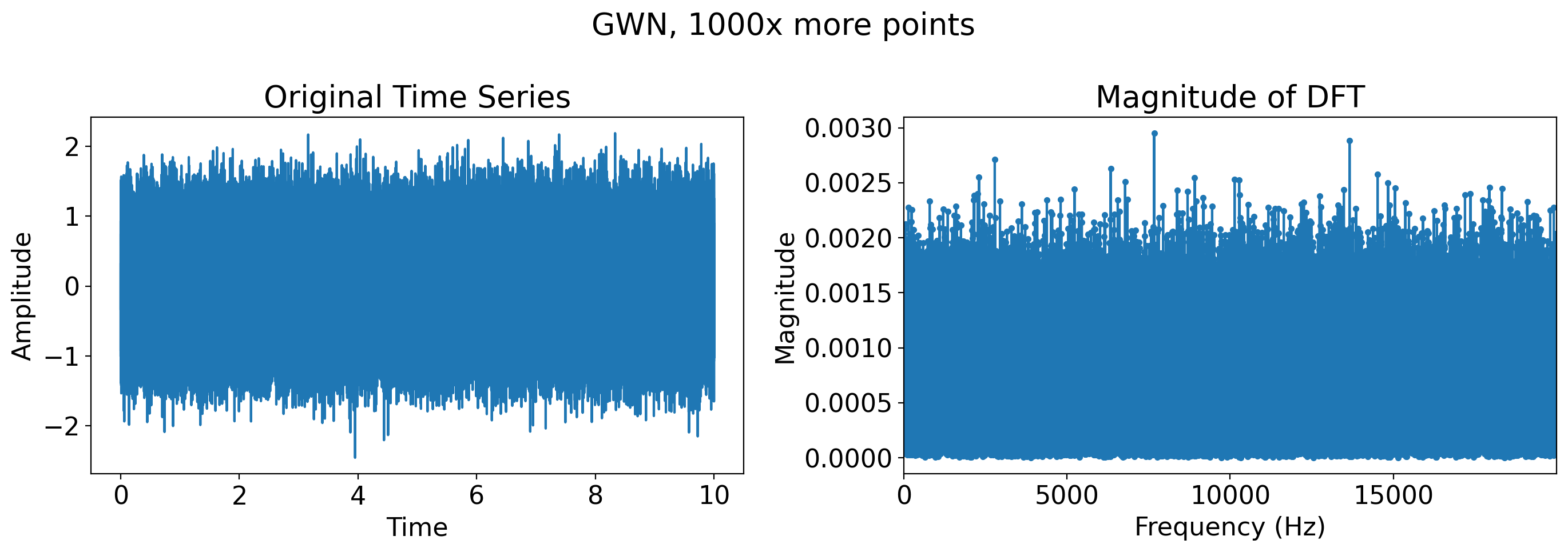
# Just Gaussian white noise, many more timesteps
more_t = t = np.linspace(0, 10, 400*1000, endpoint=False)
more_gaussian_white_noise = np.random.normal(0, 0.5, len(more_t))
plot_time_series_and_dft(t, more_gaussian_white_noise, title='GWN, 1000x more points')
7.3.4. Inverting the Fourier Transform#
Recall that the Fourier Transform generates the original timeseries exactly.
As such, once we have all the Fourier coefficients \(A_j\) and \(B_j\), we can invert them to get back the original timeseries exactly.
The next slides show this. First, with a single sine wave:
import numpy as np
import matplotlib.pyplot as plt
from scipy.fft import fft, ifft

# Create a sample time series (e.g., a sine wave)
t = np.linspace(0, 1, 400, endpoint=False)
original_timeseries = np.sin(2 * np.pi * 5 * t)  # 5 Hz sine wave

# Compute the Fourier Transform (FFT)
fft_result = fft(original_timeseries)

# Reconstruct the original time series using the Inverse Fourier Transform (iFFT)
reconstructed_timeseries = ifft(fft_result)
# Plotting
plt.figure(figsize=(12, 4))

# Plot the original time series
plt.subplot(1, 2, 1)
plt.plot(t, original_timeseries, label='Original')
plt.title("Original Time Series")
plt.xlabel("Time")
plt.ylabel("Amplitude")
plt.legend()

# Plot the reconstructed time series
plt.subplot(1, 2, 2)
plt.plot(t, reconstructed_timeseries.real, label='Reconstructed', color='orange')  # Use .real to avoid imaginary part (should be negligible)
plt.title("Reconstructed Time Series")
plt.xlabel("Time")
plt.ylabel("Amplitude")
plt.legend()

plt.tight_layout()
plt.show()
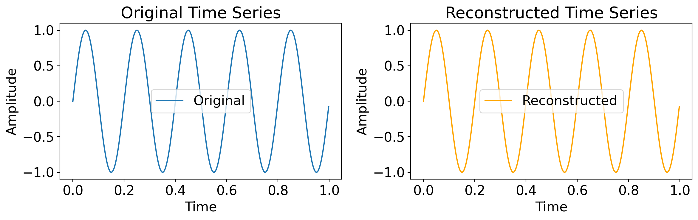
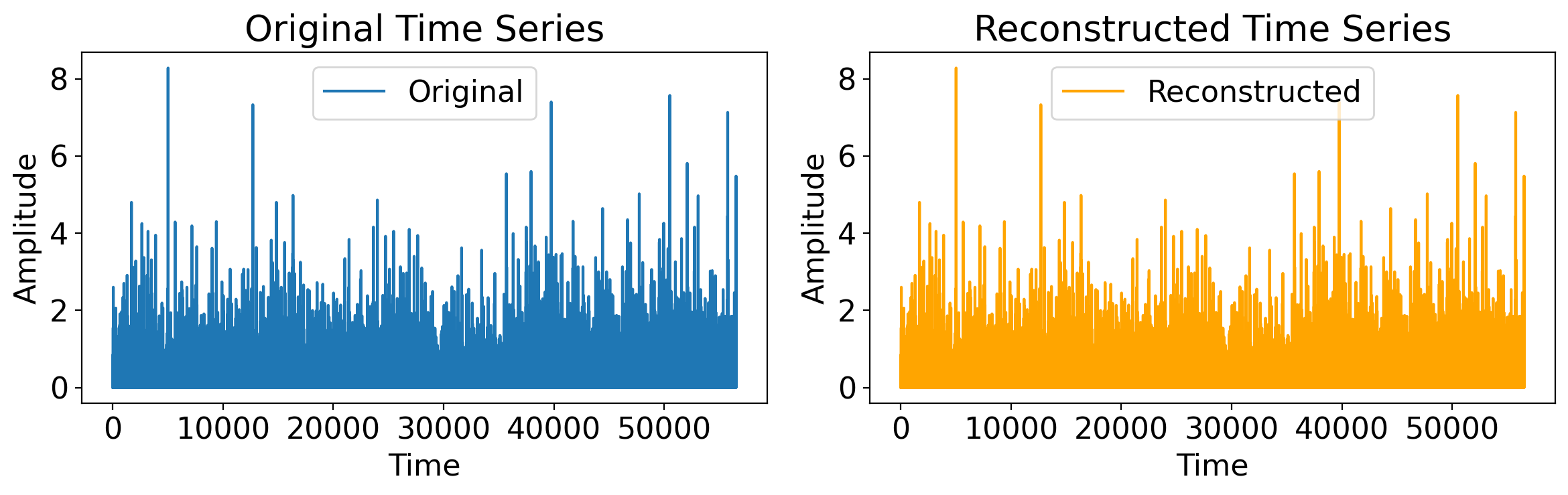
Sure, but maybe that’s trivial, a single sine wave.
Let’s do something much more involved: the daily precip timeseries from the Central Park dataset:
t = np.arange(len(ds_cp_day["time"]))
original_timeseries = ds_cp_day["precip"].values

# Compute the Fourier Transform (FFT)
fft_result = fft(original_timeseries)

# Reconstruct the original time series using the Inverse Fourier Transform (iFFT)
reconstructed_timeseries = ifft(fft_result)
# Plotting
plt.figure(figsize=(12, 4))

# Plot the original time series
plt.subplot(1, 2, 1)
plt.plot(t, original_timeseries, label='Original')
plt.title("Original Time Series")
plt.xlabel("Time")
plt.ylabel("Amplitude")
plt.legend()

# Plot the reconstructed time series
plt.subplot(1, 2, 2)
plt.plot(t, reconstructed_timeseries.real, label='Reconstructed', color='orange')  # Use .real to avoid imaginary part (should be negligible)
plt.title("Reconstructed Time Series")
plt.xlabel("Time")
plt.ylabel("Amplitude")
plt.legend()

plt.tight_layout()
plt.show()
7.3.5. Relationship between Fourier coefficients and the sample variance (Parseval’s Identity)#
How does the variance at different frequencies (i.e. the amplitudes \(A_j\) and \(B_j\)) relate to the plain-old sample variance in time, \(\hat\sigma_X^2\)?
Again, skipping over the derivation entirely, it turns out there’s a very nice relationship between them, known as Parseval’s Identity:
In words: the sample variance is the sum of the squared amplitudes at each individual frequency.
The leading factor \((N-1)/N\) of course gets closer to \(1\) as \(N\) increases, and it comes from the \(N-1\) rather than \(N\) in the denominator of the sample variance.
Let’s verify this for the Central Park daily rainfall:
cp_precip_sample_var = float(ds_cp_day["precip"].var(ddof=1).values)
print(cp_precip_sample_var)
0.12510580708459001
# Perform the FFT to get all the Fourier coefficients
fft_cp_precip = scipy.fft.fft(ds_cp_day["precip"].values)
For an apples-to-apples comparison, we have to do two extra things due to the slightly different way that FFT solves for the coefficients as noted above:
Divide each FFT value by the sample size (since the FFT algorithm doesn’t).
Drop the first FFT coefficient, a step that stems from how it handles the time mean of the array.
But with these pre-processing steps we arrive at our desired result:
sample_size = len(ds_cp_day["precip"])

# Sum the square of all the Fourier coefficients.
cp_precip_fft_mag_sum = (np.abs(fft_cp_precip[1:] / sample_size) ** 2).sum()
normed_fft_sum = sample_size / (sample_size - 1) * cp_precip_fft_mag_sum

print(f"""
Directly computed sample variance: {cp_precip_sample_var}.
Sum of square of Fourier coefficient magnitudes: {normed_fft_sum}.
Difference: {(100 - 100 * cp_precip_sample_var / normed_fft_sum):0.1f}%
""")
Directly computed sample variance: 0.12510580708459001.
Sum of square of Fourier coefficient magnitudes: 0.12510580708459001.
Difference: 0.0%
7.4. Periodograms#
7.4.1. Overview#
The Fourier transform decomposes the timeseries into the sum of contributions of sines and cosines at each of the Fourier frequencies.
The periodogram essentially fills in the gaps between that discrete number of Fourier frequencies.
And the power spectrum is essentially the same thing as the periodogram but applied to a population rather than a particular sample.
7.4.2. Definition#
The periodogram, \(\hat{p}(\omega)\), is defined as:
where \(\tau\) is lag, \(\omega\) is any (angular) frequency, and \(\hat{c}(\tau)\) is the sample autocovariance function.
In words, this is the sum over all possible lags of the autocovariance at that lag times the cosine of the product of that lag with the specified frequency.
The term angular freqency means that one complete cycle equals \(2\pi\) radians, as in the case for trigonometric functions like \(\cos\). The non-angular frequency (or just plain “frequency”) is just this divided by that \(2\pi\) factor.
The units of the periodogram values themselves are the same as those of the autocovariance.
I.e. the square of the units of the variable itself.
(Quite often, however, we’re less interested in the absolute magnitudes of the periodogram than the relative magnitudes across different frequencies, making the units and raw individual values less important.)
(In fact, the periodogram and Fourier decomposition results are unique only up to a leading constant, such that in different places you’ll see different leading factors.)
7.4.3. Interpretation#
Conceptually, you could think of this as the sum over all lags of the autocovariance, but weighted at each lag by the \(\cos(\omega\tau)\) term.
So if, across lags, there is an oscillation in the sample autocovariance \(\hat{c}(\tau)\) at a given frequency \(\omega\), then the product \(\hat{c}(\tau)\cos(\omega\tau)\) will have large magnitude when summed across all lags.
For example, suppose the sample autocovariance is a decaying oscillation: \(\hat{c}(\tau)\approx ae^{-b\tau}\cos(\pi\tau)\), where \(a\) and \(b\) are some constants.
Then the periodogram at that frequency would become \(\sum_\tau ae^{-b\tau}\cos^2(\pi\tau)\), which because \(\cos^2\) is never negative will always sum to a positive number.
7.4.4. Rewriting in a more useful form#
First, recall that the autocovariance is an even function of lag: \(\hat{c}(-\tau)=\hat{c}(\tau)\).
As such, we can replace the sum over all lags, \(\sum_{T=-(N-1)}^{N-1}\), with the value at lag zero plus twice the value at each positive lag: \(\hat c(0)+2\sum_{T=1}^{N-1}\).
Second, recall that the sample autocovariance at zero lag is nearly the sample variance—it just has \(N\) rather than \(N-1\) as the denominator.
That is, if \(\hat\sigma\) is the sample variance, then \(\hat c(0)=\frac{N-1}{N}\hat\sigma\).
Third, from trigonometry, we know two things:
\(\cos(x)=-\cos(x+\pi)\)
\(\cos\) is periodic with period \(2\pi\): \(\cos(x)=\cos(x+2\pi k)\) for any \(k\).
Let’s use numpy to quickly re-convince ourselves of these:
print(np.all([np.isclose(np.cos(x), -np.cos(x+np.pi)) for x in np.linspace(0, 2*np.pi, 1000)]))
print(np.all([np.isclose(np.cos(x), np.cos(x + 2 * np.pi)) for x in np.linspace(0, 2*np.pi, 1000)]))
True
True
That means that we only need to compute the periodogram for frequencies from 0 to \(\pi\): \(0<\omega\leq\pi\).
All together, these mean we can rewrite the periodgram as follows:
for any \(\omega\) in \(0<\omega\leq\pi\).
In words, for any given frequency \(\omega\), the periodgram equals the sample variance plus twice the sum of the autocovariance across all nonzero lags of the product of the autocovariance at that lag with the cosine of the frequency times that lag.
7.4.5. In Python#
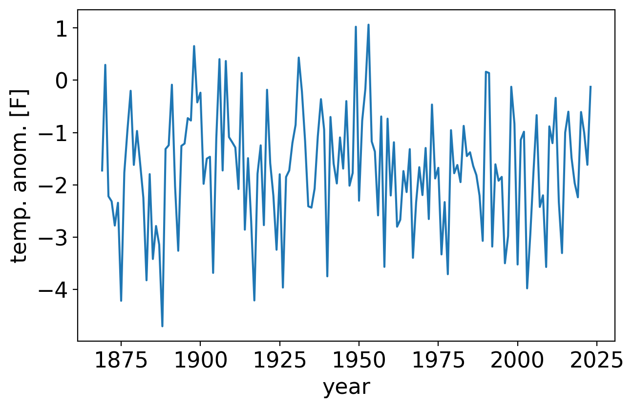
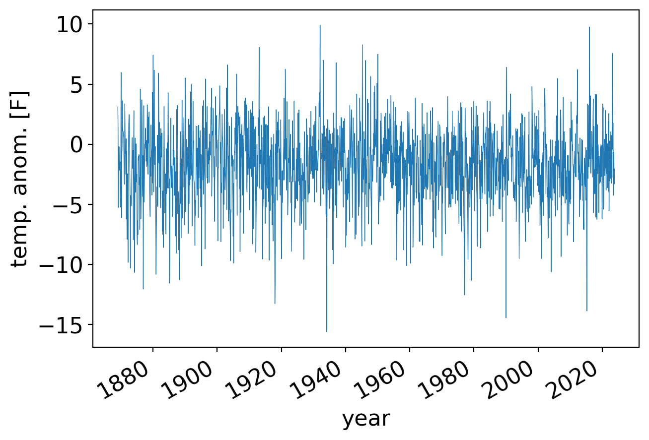
Let’s implement the periodogram in python and apply it to temperature anomalies in the Central Park dataset.
First, we’ll plot the timeseries itself:
fig, ax = pplt.faceted_ax(width=6)
tanom_dt_ann.plot(ax=ax)
ax.set_xlabel("year")
ax.set_ylabel("temp. anom. [F]")
Text(0, 0.5, 'temp. anom. [F]')
Next, we’ll code up the periodogram from scratch and compare it to scipy’s scipy.stats.periodogram to verify it’s correct.
Our code:
def periodogram_raw(arr, freq=None):
    """Compute the periodogram of a given 1-D array."""
    # Process the inputted frequencies.
    if freq is None:
        freq = np.linspace(0, 0.5, 100)
    if np.ndim(freq) == 1:
        freq = freq[np.newaxis,:]
    ang_freq = 2. * np.pi * freq

    # Compute the autocovariance and corresponding periodogram.
    acov = autocov(arr)
    pgram = acov[0] + 2 * np.sum(
        acov[1:,np.newaxis] * np.cos(ang_freq * np.arange(1, len(arr))[:,np.newaxis]),
        axis=0)
    return ang_freq[0] / (2. * np.pi), pgram
Now, we’ll verify the results are correct vs. scipy:
freqs, pgram_scipy = scipy.signal.periodogram(tanom_dt_ann)
_, pgram_ours = periodogram_raw(tanom_dt_ann, freqs)
# Scipy's normalization convention is twice that of ours, hence we double our values for comparison.
print(np.allclose(pgram_scipy, 2. * pgram_ours))
True
For larger arrays (such as the daily temperature anomalies we’ll see soon), our very simple algorithm is way too slow, whereas scipy’s is highly optimized for speed.
So moving forward we’ll just use scipy, creating a simple function that divides it by two to be consistent with our notation as described above.
And we’ll have it return an xarray.DataArray rather than numpy.ndarray, since xarray objects provide more metadata and functionality:
def xperiodogram(*args, **kwargs):
    """Wrapper around scipy.signal.periodogram."""
    freqs, pgrams = scipy.signal.periodogram(*args, **kwargs)
    return xr.DataArray(
        0.5 * pgrams,
        dims=["frequency"],
        coords={"frequency": freqs},
        name="periodogram",
    )
The frequencies that scipy.signal.periodogram outputs range from 0 to 0.5, with units of cycles per timestep. (Why they stop at 0.5, the Nyquist frequency, is discussed further below.)
print(freqs[0], freqs[-1])
0.0 0.4967741935483871
In this case, for a timeseries of consecutive annual temperature anomalies, the timestep is one year, so the units of frequency are cycles per year.
So the highest value, which we’ll round up to 0.5, corresponds to one half cycle per year, or equivalently a period of 2 years.
OK, let’s plot it, with frequency as the x axis and the periodgram value at that frequency the y axis. (We’ll overlay on the top axis the period corresponding to the given frequency):
fig, ax = pplt.faceted_ax(width=6, aspect=0.5)
ax.plot(freqs, 0.5 * pgram_scipy, label="scipy")
ax.plot(freqs, pgram_ours, label="ours", linestyle="--")

ax.set_xlim(0, 0.5)
ax.set_xlabel("frequency [cycles per year]")
ax.set_ylabel(r"periodogram [$^\circ$F$^2$]")

# Overlay periods as top axis.
ax2 = ax.twiny()
ax2.set_xticks(ax.get_xticks()[1:])
ax2.set_xbound(ax.get_xbound())
ax2.set_xticklabels(["{:.2f}".format(1/x) for x in ax.get_xticks()[1:]])
_ = ax2.set_xlabel("period [years]")
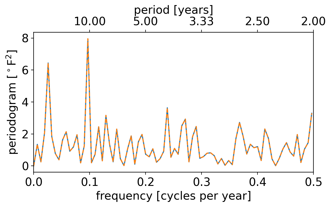
Our result and the scipy result are indeed identical, so that’s good. What else do you see?
The largest peak occurs just below 0.1 cycles per year. Admittedly, it’s not obvious to your professor what physical process would give rise to a roughly decadal oscillation like this in the annual temperature anomalies.
The next largest peak is at an even lower frequency.
However, with frequency plotted in a linear scale like this, the low-frequency / long-timescale behaviors all get smushed together on the far left, making it hard to discern things precisely.
And conversely, the faster timescale behaviors take up most of the plotted domain: notice that nearly a third of the axis is taken up by periods between roughly 2 and 3.
One way to avoid this would be to invert the horizontal axis spacing, so that it’s linear in period rather than frequency:
fig, ax = pplt.faceted_ax()
# Drop the first element, which is 0 frequency, to avoid divide-by-zero.
ax.plot(1 / freqs[1:], pgram_scipy[1:])
ax.set_xlim(0, 155)
ax.set_xticks(np.arange(0, 141, 20))
ax.set_xticks(np.arange(5, 156, 5), minor=True)

ax.set_xlabel("period [years]")
ax.set_ylabel(r"periodogram [$^\circ$F$^2$]")
ax.set_ylim(0, 17)
(0.0, 17.0)
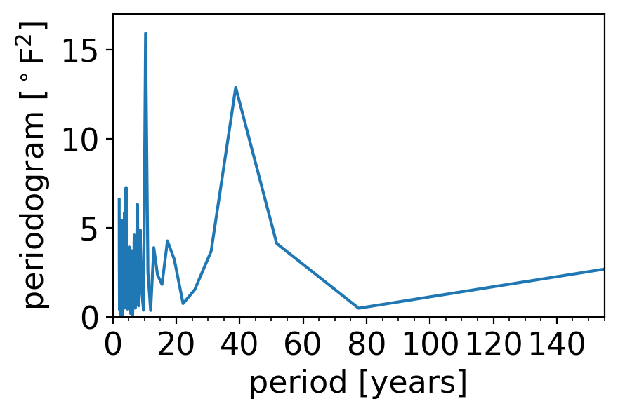
Now we see clearly that the secondary peak has a period of around 40 years.
But now we have the opposite problem: the short frequency behavior is really squished, and the long-timescale behavior is way stretched out.
A nice compromise is to plot either the frequency or period with logarithmic spacing. In the next plot, the left panel shows this using frequency, and the right panel shows this using period:
fig, axarr = pplt.faceted(1, 2, width=8, sharex=False, internal_pad=0.5)

# Left panel: log(frequency)
axf = axarr[0]
axf.semilogx(freqs, pgram_scipy)
axf.set_xlim(1e-2, 0.5)
axf.set_xticks(1. / np.array([2, 10, 50, 100]))
axf.set_xlabel("frequency [cycles per year]")
axf.set_ylabel(r"periodogram [$^\circ$F$^2$]")

axf2 = axf.twiny()
axf2.set_xscale('log')
axf2.set_xticks(axf.get_xticks())
axf2.set_xbound(axf.get_xbound())
axf2.set_xticklabels(["{:.0f}".format(1/x) for x in axf.get_xticks()])
axf2.set_xlabel("period [years]")

# Right panel: log(period)
axp = axarr[1]
axp.semilogx(1 / freqs[1:], pgram_scipy[1:])
axp.set_xticks(np.array([2, 10, 50, 100]))
axp.set_xlabel("period [years]")
axp.set_xlim(2, 155)
axp.set_ylim(0, 17)
(0.0, 17.0)
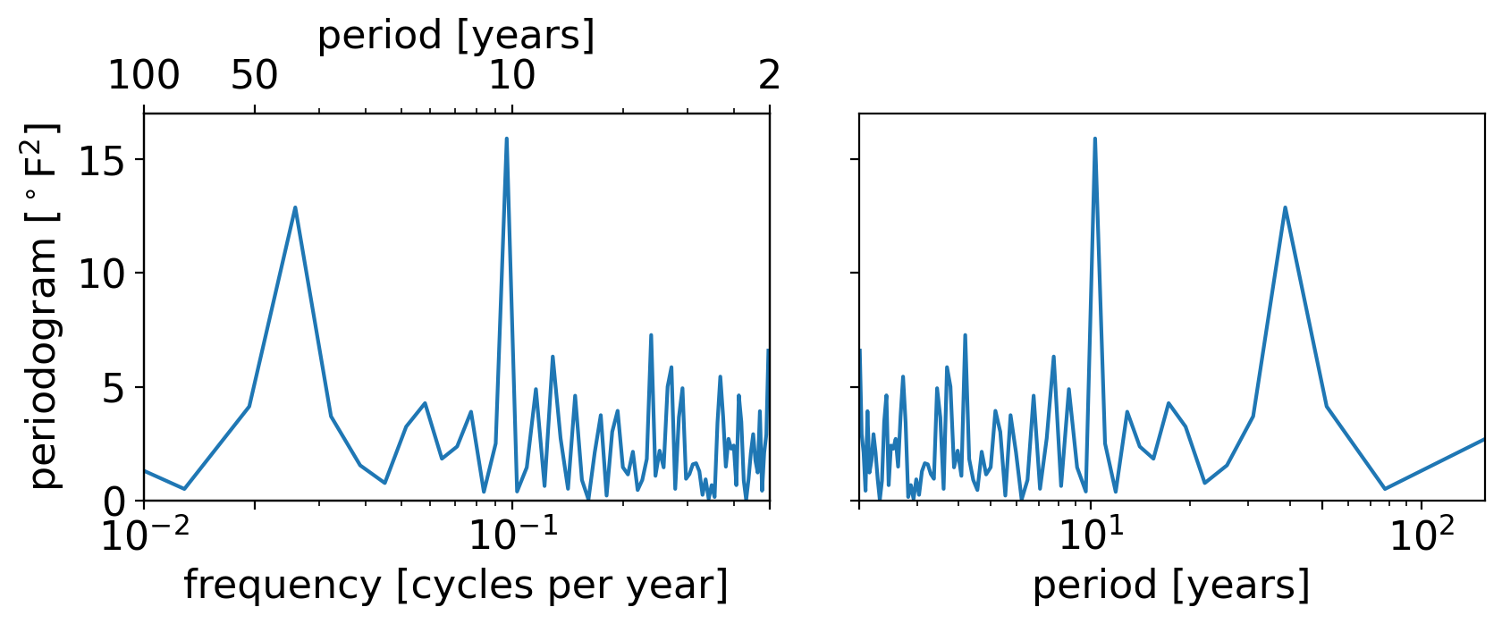
The two plots are identical, just mirrored in the horizontal. (To convince yourself of this, try re-running the cell above with the xlim of either panel reversed. For example: try axp.set_xlim(155, 2))
And they strike a nice compromise, with neither the low nor high frequencies too smushed.
So we’ll stick with the log spacing moving forward.
Let’s now look at the periodogram of the monthly rather than annual anomalies. First, the timeseries itself:
fig, ax = pplt.faceted_ax(width=6)
tanom_dt_mon.plot(ax=ax, linewidth=0.5)
ax.set_xlabel("year")
ax.set_ylabel("temp. anom. [F]")
Text(0, 0.5, 'temp. anom. [F]')
Now, the corresponding periodogram:
pgram_mon = xperiodogram(tanom_dt_mon)
fig, ax = pplt.faceted_ax()
pplt.mark_x0(ax, x0=1/12., linewidth=3, linestyle="--")
pgram_mon.plot(ax=ax, xscale="log")
ax.set_xlim(1e-3, 0.5)
ax.set_xticks(1. / np.array([2, 10, 100, 1000]))
ax.set_xlabel("frequency [cycles per month]")
ax.set_ylabel(r"periodogram [$^\circ$F$^2$]")

ax2 = ax.twiny()
ax2.set_xscale('log')
ax2.set_xticks(ax.get_xticks())
ax2.set_xbound(ax.get_xbound())
ax2.set_xticklabels(["{:.0f}".format(1/x) for x in ax.get_xticks()])
ax2.set_xlabel("period [months]")
Text(0.5, 0, 'period [months]')
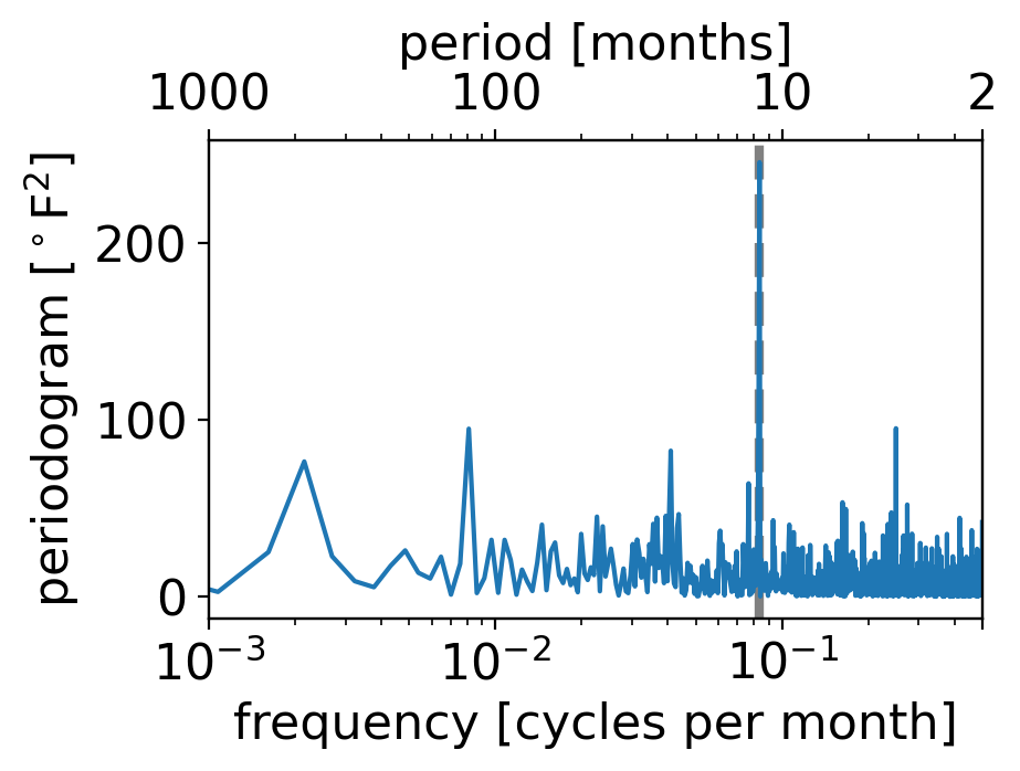
What do you see?
By far the strongest peak is right at one cycle per twelve months, i.e. once per year.
(The dashed grey vertical line shows that exact once-yearly frequency.)
But these are temperature anomalies from the seasonally varying long-term average. Shouldn’t there be no seasonal cycle in that case?
The answer lies in the fact that the magnitude of temperature fluctuations is itself seasonal: in New York City (as much of the extratropics), daily and monthly weather fluctuations are larger than they are in summer.
We can see this by plotting the standard deviation of the daily and monthly temperature anomalies, for each calendar month separately:
fig, ax = pplt.faceted_ax(width=6, aspect=0.5)
tanom_dt_day.groupby("time.month").std().plot(ax=ax, label="daily")
tanom_mon_stdev_mon = tanom_dt_mon.groupby("time.month").std()
tanom_mon_stdev_mon.plot(ax=ax,label="monthly")
ax.legend(loc=(1.05, 0.2))
<matplotlib.legend.Legend at 0x163b8bb10>
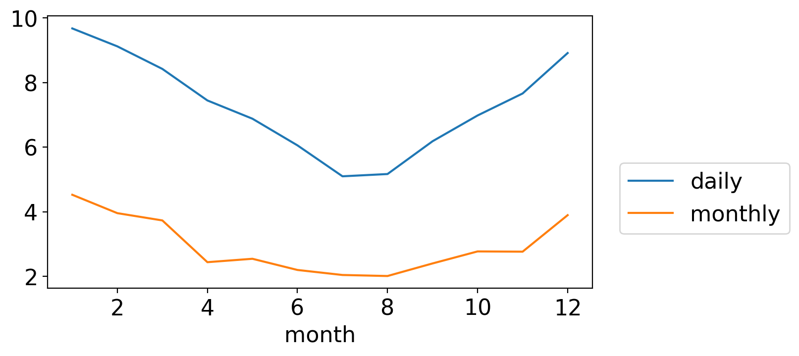
Both are largest in winter and smallest in summer. (And, not surprisingly, daily fluctuations are generally larger in magnitude than the monthly averages of those daily wiggles.)
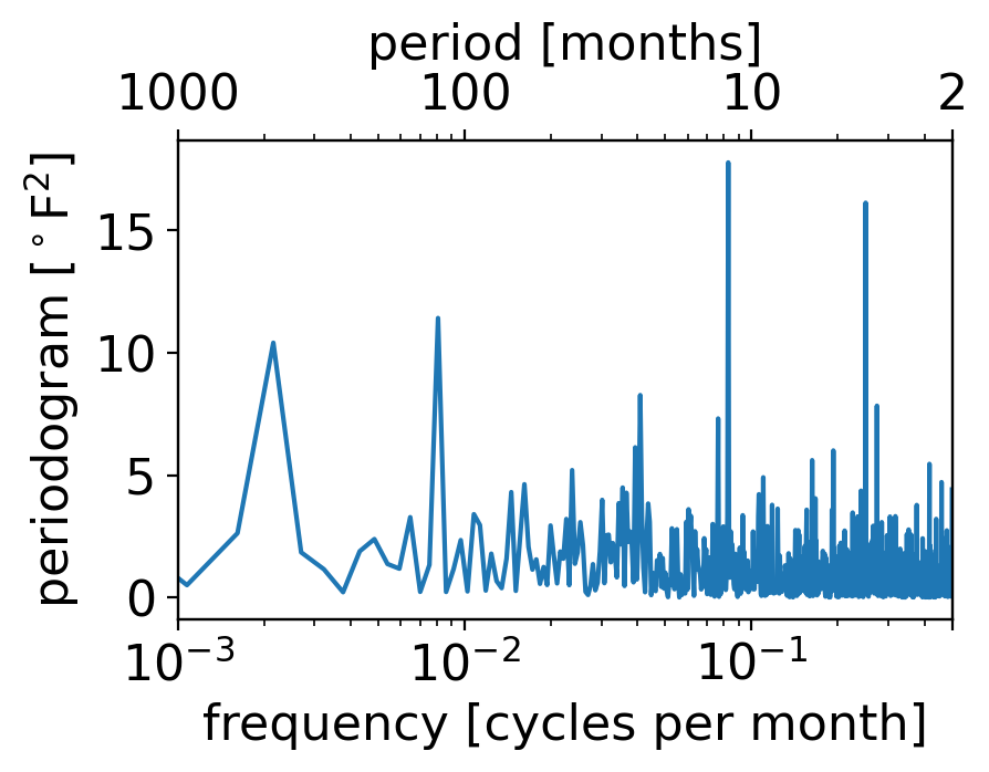
To confirm this intuition, we can generate a normalized monthly anomaly timeseries, where each value is divided by the standard devaition for that calendar month:
The result is a dimensionless timeseries with identical variance across all calendar months:
tanom_dt_mon_std_normed = tanom_dt_mon / tanom_mon_stdev_mon.sel(
    month=tanom_dt_mon.time.dt.month)
If we plot its periodogram, we see all the same signals as the full case except the 12-month one has gone way down (even if it hasn’t gone away entirely):
pgram_mon_norm = xperiodogram(tanom_dt_mon_std_normed)
fig, ax = pplt.faceted_ax()
pgram_mon_norm.plot(ax=ax, xscale="log")
ax.set_xlim(1e-3, 0.5)
ax.set_xticks(1. / np.array([2, 10, 100, 1000]))
ax.set_xlabel("frequency [cycles per month]")
ax.set_ylabel(r"periodogram [$^\circ$F$^2$]")

ax2 = ax.twiny()
ax2.set_xscale('log')
ax2.set_xticks(ax.get_xticks())
ax2.set_xbound(ax.get_xbound())
ax2.set_xticklabels(["{:.0f}".format(1/x) for x in ax.get_xticks()])
ax2.set_xlabel("period [months]")
Text(0.5, 0, 'period [months]')
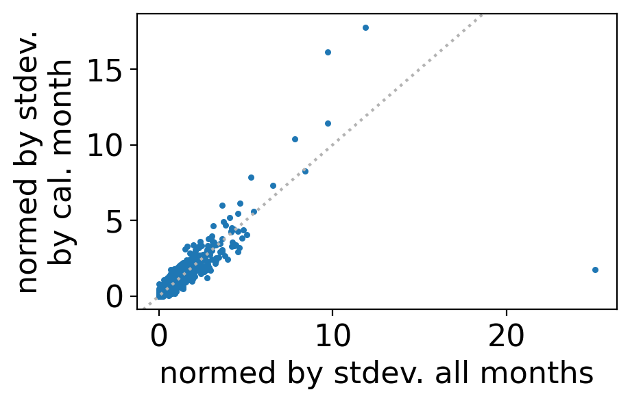
We can see this especially clearly by comparing to the version where the normalization is by the annual rather than monthly-varying standard deviation:
pgram_mon_ann_norm = xperiodogram(tanom_dt_mon / tanom_dt_mon.std())
Then a scatterplot of the two periodogram values reveals that they mostly fall close to the one-to-one line, except the one massive outlier corresponding to this once-yearly cycle:
fig, ax = pplt.faceted_ax()
ax.scatter(pgram_mon_ann_norm, pgram_mon_norm, s=5)
pplt.mark_one2one(ax)
ax.set_xlabel("normed by stdev. all months")
ax.set_ylabel("normed by stdev.\nby cal. month")
Text(0, 0.5, 'normed by stdev.\nby cal. month')
Now, let’s look at the daily anomalies, which recall look like this:
fig, ax = pplt.faceted_ax(width=6)
tanom_dt_day.plot(linewidth=0.5)
plt.ylabel("T anom [F]")
Text(0, 0.5, 'T anom [F]')
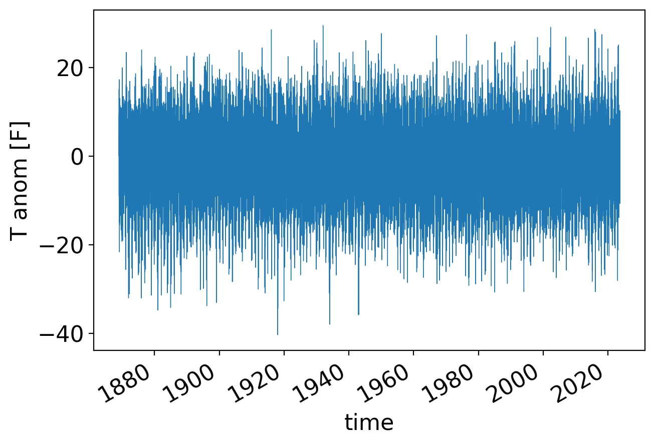
In its periodogram, the once per year signal shows up even more prominently than for the monthly averages:
pgram_daily = xperiodogram(tanom_dt_day)

fig, ax = pplt.faceted_ax()
pgram_daily.plot(ax=ax, xscale="log")

periods = np.array([2, 10, 100, 1000, 10000])
ax.set_xlabel("Period (days)")
ax.set_xticks(1 / periods)
ax.set_xticklabels(periods)
ax.set_xticks([], minor=True)
ax.set_ylabel(r"periodogram [$^\circ$F$^2$]")
Text(0, 0.5, 'periodogram [$^\\circ$F$^2$]')
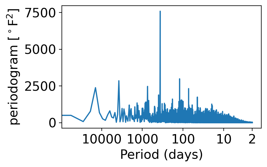
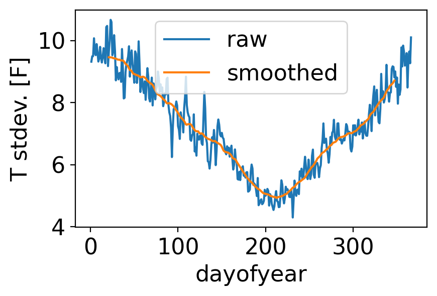
The reason is the same as for the monthly case: daily temperature variance is greater in winter than in summer:
fig, ax = pplt.faceted_ax()
tanom_dt_day.groupby("time.dayofyear").std().plot(label="raw")
tanom_dt_day.groupby("time.dayofyear").std().rolling(dayofyear=40, center=True).mean().plot(label="smoothed")
ax.legend()
ax.set_ylabel("T stdev. [F]")
Text(0, 0.5, 'T stdev. [F]')
Let’s repeat but for the full temperature field—not the departures from normal—which of course has a very strong annual cycle:
fig, ax = pplt.faceted_ax(width=6)
temp_avg_filled = ds_cp_day["temp_avg"].plot(linewidth=0.5)
ax.set_ylabel("daily avg T [F]")
Text(0, 0.5, 'daily avg T [F]')
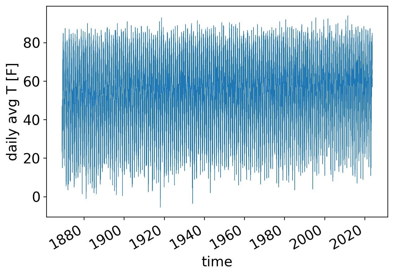
Now we have to do some data cleaning.
Recall that there are some missing values early in the record that we dropped. These NaN values will cause scipy.signal.periodogram to break, returning just all NaNs:
_, pgrams_with_nans = scipy.signal.periodogram(ds_cp_day["temp_avg"])
np.all(np.isnan(pgrams_with_nans))
True
These bad values all occur before the year 1960. So for simplicity we’ll just restrict to values after 1959:
temp_day_post1959 = ds_cp_day["temp_avg"].sel(time=slice("1960", None))
Finally, let’s compute and plot the periodogram of this post-1959 daily temperature timeseries:
pgram_daily_full = xperiodogram(temp_day_post1959)

fig, ax = pplt.faceted_ax()
pgram_daily_full.plot(ax=ax, xscale="log")

periods = np.array([2, 10, 100, 1000, 10000])
ax.set_xlabel("Period (days)")
ax.set_xticks(1 / periods)
ax.set_xticklabels(periods)
ax.set_xticks([], minor=True)
ax.set_ylabel(r"periodogram [$^\circ$F$^2$]")
Text(0, 0.5, 'periodogram [$^\\circ$F$^2$]')
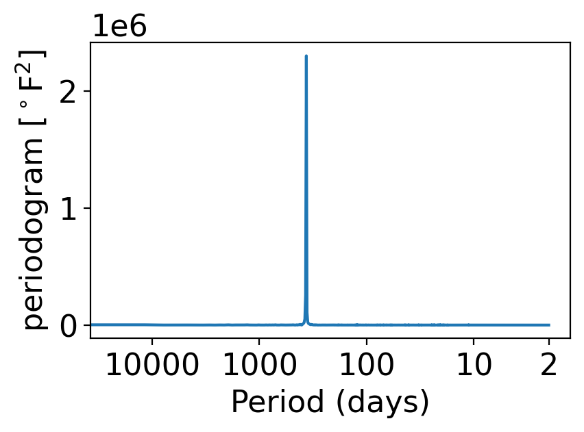
This looks like a delta function: zero everywhere except a single, huge spike.
In fact, we won’t go into the math whatsoever, but indeed if a timeseries has a regular periodic component, it is precisely the case that that frequency will show up as (the finite approximation to) a delta function in the periodogram.
If you find yourself with a periodogram that looks like this, but you want to be able to discern behaviors other than the giant spike, you have two options:
Option 1: remove the periodic component in some way (that’s what the temp_anom variable is: temp_avg but with its regular seasonal cycle subtracted off).
Option 2: use log spacing for the vertical axis, which makes variations visible across a wider range of scales:
fig, ax = pplt.faceted_ax()
pgram_daily_full.plot(ax=ax, xscale="log", yscale="log", color="black", linewidth=0.5)

periods = np.array([2, 10, 100, 1000, 10000])
ax.set_xlabel("Period (days)")
ax.set_xticks(1 / periods)
ax.set_xticks([], minor=True)
ax.set_xticklabels(periods)
ax.set_ylim(1e-4, 1e8)
ax.set_ylabel(r"periodogram [$^\circ$F$^2$]")
Text(0, 0.5, 'periodogram [$^\\circ$F$^2$]')
What do you see?
The y axis spans a massive 11 orders of magnitude (meaning the largest values are \({\sim}10^{11}\times\) bigger than the smallest ones)!
The annual peak is ~4 orders of magnitude larger than any other signal
At high frequencies (above ~100 days), there’s a gradual sloping down. (We won’t go into it, but this is the signature of a “red noise” or Brownian noise process, one of multiple colors of noise in addition to white noise.)
7.5. The Nyquist frequency and aliasing#
Why didn’t we show the frequencies larger than 0.5 in the periodgram plots above?
One cycle per year means that the signal goes up and back down one full time in the year.
But we only have a single value for each year. So how could we resolve something that is changing within the course of the year?
The answer is: we can’t!
Think about it: what’s the highest possible frequency that could be meaningfully resolved in any timeseries, given that at each timestep there is one single value?
Well, one timestep could be the signal going up, and the next timestep the signal going back down, and so on.
That would be a frequency of 1 cycle per two timesteps. This special frequency is called the Nyquist frequency.
Signals at frequencies higher than the Nyquist frequency cannot be reliably discerned.
They should therefore not be plotted or otherwise used—even though there’s nothing preventing us (or scipy) from computing them!
The issue is that signals at frequencies higher than the Nyquist frequency are prone to aliasing: the inability to discern between (certain) different frequencies given finite sampling.
For example, consider this sine wave in solid, and the signals you get from sampling at the Nyquist frequency (blue stars) or a lower frequency (red squares):
freq = 1.
t = np.linspace(0, 4, 1000)
cos_true = np.cos(2. * np.pi * t)
t_nyq = np.arange(0, freq * 4 + 0.01, 0.5 * freq)
cos_nyq = np.cos(2. * np.pi * t_nyq)
t_0p75 = np.arange(0, freq * 4 + 0.01, 0.75 * freq)
cos_0p75 = np.cos(2. * np.pi * t_0p75)

fig, ax = pplt.faceted_ax(width=8, aspect=0.5)
pplt.mark_y0(ax)

ax.plot(t, cos_true, color="grey", label="orig")
ax.scatter(t_nyq, cos_nyq,  marker="*", s=140, color="blue", label="sub-sampled, resolved")
ax.scatter(t_0p75, cos_0p75, marker="s", s=60, color="red", label="sub-sampled, spurious")
ax.legend(loc=(1.05, 0.3))
<matplotlib.legend.Legend at 0x1640cf250>
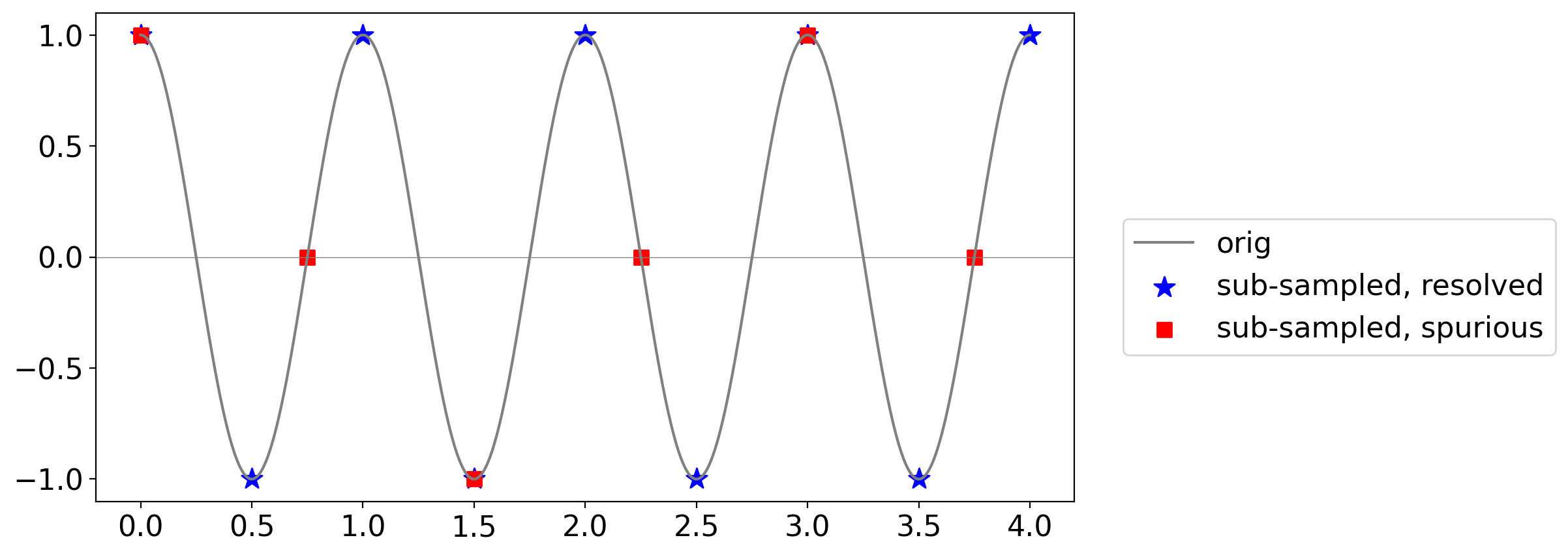
The blue stars correctly trace out the cycles of the original signal.
But the red squares give the false impression of a lower-frequency wave: this is aliasing.
7.6. Power spectral density#
As mentioned above, the power spectral density is the same thing as a periodogram, but it applies to populations rather than samples.
7.6.1. Special case: white noise#
It turns out that the power spectral density of a pure white process is uniform in frequency.
In other words, because every value is totally random and independent of all the others, there is no preferred frequency.
For Gaussian white noise, this constant value is equal to its variance \(\sigma^2\).
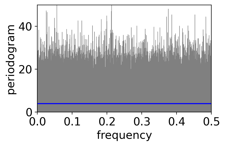
Let’s plot the periodogram of 1000 timesteps of a GWN process to see if this checks out:
variance = 4
num_draws = int(1e3)
pgram_whitenoise_1e3 = xperiodogram(np.random.normal(0, np.sqrt(variance), num_draws))

fig, ax = pplt.faceted_ax()
pgram_whitenoise_1e3.plot(ax=ax, color="grey", linewidth=0.5)
ax.axhline(y=variance, color="blue")
ax.set_xlim(0, 0.5)
ax.set_ylim(0, 30)
ax.set_xlabel("frequency")
ax.set_ylabel(r"periodogram")
Text(0, 0.5, 'periodogram')
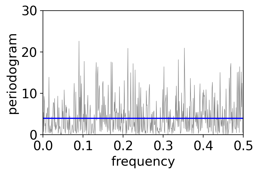
The periodogram values do average to approximately the variance as claimed:
pgram_whitenoise_1e3.mean()
<xarray.DataArray 'periodogram' ()>
array(4.41469293)
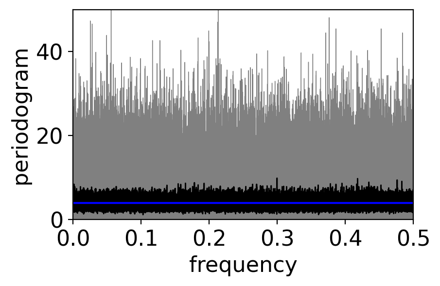
But there’s a ton of scatter! Usually in statistics, we beat down the noise via a larger sample size. Let’s try that:
num_draws = int(1e6)
pgram_whitenoise_1e6 = xperiodogram(np.random.normal(0, np.sqrt(variance), num_draws))

fig, ax = pplt.faceted_ax()
pgram_whitenoise_1e6.plot(ax=ax, color="grey", linewidth=0.5)
ax.axhline(y=variance, color="blue")
ax.set_xlim(0, 0.5)
ax.set_ylim(0, 50)
ax.set_xlabel("frequency")
ax.set_ylabel(r"periodogram")
print(f"mean across frequencies: {pgram_whitenoise_1e6.mean()}")
mean across frequencies: <xarray.DataArray 'periodogram' ()>
array(3.99405946)
There is no less scatter! What’s going on?
It turns out that the variance across frequencies in a periodogram does not decrease with increasing sample size!
It does decrease however if you apply a running average to the periodogram:
fig, ax = pplt.faceted_ax()
pgram_whitenoise_1e6.plot(ax=ax, color="grey", linewidth=0.5)
pgram_whitenoise_1e6.rolling(frequency=20, center=True).mean().plot(
    ax=ax, color="black", linewidth=1)
ax.axhline(y=variance, color="blue")
ax.set_xlim(0, 0.5)
ax.set_ylim(0, 50)
ax.set_xlabel("frequency")
ax.set_ylabel(r"periodogram")
Text(0, 0.5, 'periodogram')
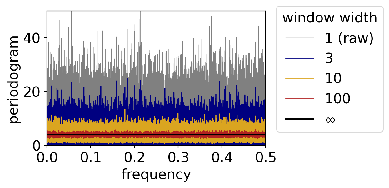
The larger the averaging window, the more the noise gets beaten down:
fig, ax = pplt.faceted_ax()
pgram_whitenoise_1e6.plot(ax=ax, color="grey", linewidth=0.5, label="1 (raw)")
for window, color in zip([3, 10, 100], ["navy", "goldenrod", "firebrick"]):
    pgram_whitenoise_1e6.rolling(frequency=window, center=True).mean().plot(
    ax=ax, color=color, linewidth=1, label=window)
ax.axhline(y=variance, color="black", label=r"$\infty$")
ax.legend(loc=(1.05, 0.1), title="window width")
ax.set_xlim(0, 0.5)
ax.set_ylim(0, 50)
ax.set_xlabel("frequency")
ax.set_ylabel(r"periodogram")
Text(0, 0.5, 'periodogram')
7.6.2. Smoothing the periodogram, beyond white noise#
Except for the case of white noise, the power spectral density does vary with frequency. (For example, the power spectral densities corresponding to the temperature anomaly periodograms we saw above.)
As such, applying a running average, like any smoothing process, essentially smears out some of the signal.
As such, there’s a balance to strike: too narrow a window leaves too much noise, but too wide a window can inadvertently remove real signals.
We’ll illustrate this by applying different averaging windows to the daily temperature anomalies:
fig, ax = pplt.faceted_ax()
pgram_daily.plot(ax=ax, xscale="log", color="grey", linewidth=0.5, label="raw")
pgram_daily.rolling(frequency=5, center=True).mean().plot(
    ax=ax, xscale="log", color="navy", label="5 pt. mean")
pgram_daily.rolling(frequency=101, center=True).mean().plot(
    ax=ax, xscale="log", color="firebrick", label="101 pt. mean")
periods = np.array([2, 10, 100, 1000, 10000])
ax.set_xlabel("Period (days)")
ax.set_xticks(1 / periods)
ax.set_xticklabels(periods)
ax.set_xticks([], minor=True)
ax.set_xlim(1e-5, 0.5)
ax.set_ylabel(r"periodogram [$^\circ$F$^2$]")
ax.set_ylim(1e-3, 3e3)
ax.legend(loc=(1.05, 0.1))
<matplotlib.legend.Legend at 0x1645cdc50>
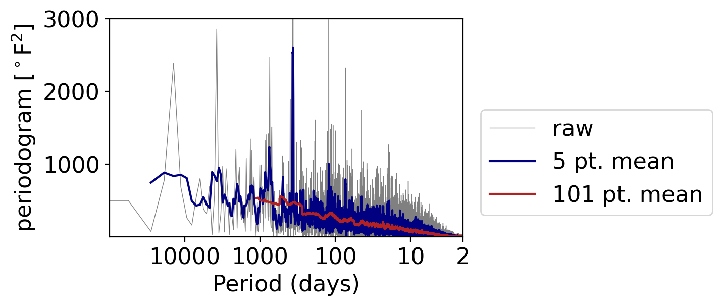
What do you see?
With the 5-point-wide window (meaning the point plus two on either side), we retain the once-yearly peak.
But going to a 101 points (meaning the point and 50 on either side), the peak is almost indiscernible from the otherwise general decrease in power moving as frequency increases.
7.7. Wrapping up#
Spectral analysis is a powerful tool for identifying key periodicities in your data.
But getting the calculations done properly and interpreting them correctly can be challenging!
And what we’ve covered is really just the tip of the iceberg.