5. Linear regression#
Warning
Under construction
This notebook comprises various text and code snippets for generating plots and other content for the lectures corresponding to this topic. It is not a coherent set of lecture notes. Students should refer to the actual lecture slides available on Blackboard.
5.1. (notebook preliminaries)#
%matplotlib inline
%config InlineBackend.figure_format = "retina"
import numpy as np
import matplotlib.pyplot as plt
import seaborn as sns
# Make fonts bigger for slides
plt.rcParams['font.size'] = 16
import xarray as xr

# Load the data
filepath_in = "../data/central-park-station-data_1869-01-01_2023-09-30.nc"
ds_cp = xr.open_dataset(filepath_in)

# Clean: drop all 0 values of the temperature fields which are (mostly) spurious
for varname in ["temp_avg", "temp_min", "temp_max"]:
    ds_cp[varname] = ds_cp[varname].where(ds_cp[varname] != 0.)
5.2. Motivation#
5.2.1. Schematics#
import matplotlib.pyplot as plt
import numpy as np
from sklearn.linear_model import LinearRegression
# Generate random data
np.random.seed(0)
X = np.random.normal(0, 1, 50).reshape(-1, 1)
y = 3 * X.squeeze() + 4 + np.random.normal(0, 1, 50)
# Fit linear regression model
model = LinearRegression()
model.fit(X, y)
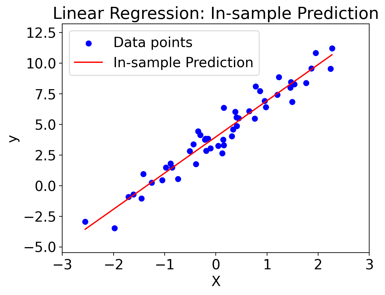
# Generate prediction points (in-sample)
X_pred_in_sample = np.linspace(min(X), max(X), 50).reshape(-1, 1)
y_pred_in_sample = model.predict(X_pred_in_sample)
# Plotting
plt.scatter(X, y, color='blue', label='Data points')
plt.plot(X_pred_in_sample, y_pred_in_sample, 'r-', label='In-sample Prediction')
plt.xlabel('X')
plt.ylabel('y')
plt.xlim(-3, 3) # Axis limits from the previous example
plt.ylim(min(y) - 2, max(y) + 2) # Axis limits from the previous example
plt.legend()
plt.title('Linear Regression: In-sample Prediction')
plt.show()
import matplotlib.pyplot as plt
import numpy as np
from sklearn.linear_model import LinearRegression
# Generate random data
np.random.seed(0)
X = np.random.normal(0, 1, 50).reshape(-1, 1)
y = 3 * X.squeeze() + 4 + np.random.normal(0, 1, 50)
# Fit linear regression model
model = LinearRegression()
model.fit(X, y)
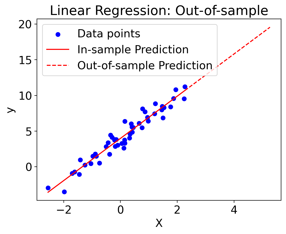
# Generate prediction points (both in-sample and out-of-sample)
X_pred_in_sample = np.linspace(min(X), max(X), 50).reshape(-1, 1)
X_pred_out_of_sample = np.linspace(max(X), max(X) + 3, 20).reshape(-1, 1)
y_pred_in_sample = model.predict(X_pred_in_sample)
y_pred_out_of_sample = model.predict(X_pred_out_of_sample)
# Plotting
plt.scatter(X, y, color='blue', label='Data points')
plt.plot(X_pred_in_sample, y_pred_in_sample, 'r-', label='In-sample Prediction')
plt.plot(X_pred_out_of_sample, y_pred_out_of_sample, 'r--', label='Out-of-sample Prediction')
plt.xlabel('X')
plt.ylabel('y')
plt.legend()
plt.title('Linear Regression: Out-of-sample')
plt.show()
import numpy as np
from bokeh.layouts import row
from bokeh.plotting import figure, show, curdoc
from bokeh.models import ColumnDataSource
import panel as pn

# Generate synthetic data
np.random.seed(0)
X = np.random.normal(0, 1, 50)
y = 3 * X + 4 + np.random.normal(0, 1, 50)

# Set up initial data source and plot
source = ColumnDataSource(data=dict(x=X, y=y))
p = figure(title='Interactive Linear Regression')
p.scatter('x', 'y', source=source, legend_label='Data Points')
line_source = ColumnDataSource(data=dict(x=[], y=[]))
p.line('x', 'y', source=line_source, color='red', legend_label='Regression Line')

# Extend the regression line beyond data points
x_extended = np.linspace(min(X) - 2, max(X) + 2, 50)

def update_line(event):
    slope = slope_slider.value
    intercept = intercept_slider.value
    y_pred = slope * x_extended + intercept
    line_source.data = dict(x=x_extended, y=y_pred)

# Sliders for slope and intercept
slope_slider = pn.widgets.FloatSlider(name='Slope', start=-10, end=10, value=3)
intercept_slider = pn.widgets.FloatSlider(name='Intercept', start=-10, end=10, value=4)

for w in [slope_slider, intercept_slider]:
    w.param.watch(update_line, 'value')

# Initial update
update_line(None)

pn.Column(
    pn.Row(slope_slider, intercept_slider),
    p
)
WARNING:param.Column00123: Displaying Panel objects in the notebook requires the panel extension to be loaded. Ensure you run pn.extension() before displaying objects in the notebook.
Column
    [0] Row
        [0] FloatSlider(end=10, name='Slope', start=-10, value=3)
        [1] FloatSlider(end=10, name='Intercept', start=-10, value=4)
    [1] Bokeh(figure)
5.2.2. Global-mean surface temperature vs. sea-level#
import pandas as pd

path_gmst_nasa = "../data/nasa-gmst-ann.txt"
pd.read_csv(path_gmst_nasa)
---------------------------------------------------------------------------
FileNotFoundError                         Traceback (most recent call last)
Cell In[8], line 4
      1 import pandas as pd
      3 path_gmst_nasa = "../data/nasa-gmst-ann.txt"
----> 4 pd.read_csv(path_gmst_nasa)

File ~/miniconda3/envs/stat-methods-course/lib/python3.11/site-packages/pandas/io/parsers/readers.py:912, in read_csv(filepath_or_buffer, sep, delimiter, header, names, index_col, usecols, dtype, engine, converters, true_values, false_values, skipinitialspace, skiprows, skipfooter, nrows, na_values, keep_default_na, na_filter, verbose, skip_blank_lines, parse_dates, infer_datetime_format, keep_date_col, date_parser, date_format, dayfirst, cache_dates, iterator, chunksize, compression, thousands, decimal, lineterminator, quotechar, quoting, doublequote, escapechar, comment, encoding, encoding_errors, dialect, on_bad_lines, delim_whitespace, low_memory, memory_map, float_precision, storage_options, dtype_backend)
    899 kwds_defaults = _refine_defaults_read(
    900     dialect,
    901     delimiter,
   (...)
    908     dtype_backend=dtype_backend,
    909 )
    910 kwds.update(kwds_defaults)
--> 912 return _read(filepath_or_buffer, kwds)

File ~/miniconda3/envs/stat-methods-course/lib/python3.11/site-packages/pandas/io/parsers/readers.py:577, in _read(filepath_or_buffer, kwds)
    574 _validate_names(kwds.get("names", None))
    576 # Create the parser.
--> 577 parser = TextFileReader(filepath_or_buffer, **kwds)
    579 if chunksize or iterator:
    580     return parser

File ~/miniconda3/envs/stat-methods-course/lib/python3.11/site-packages/pandas/io/parsers/readers.py:1407, in TextFileReader.__init__(self, f, engine, **kwds)
   1404     self.options["has_index_names"] = kwds["has_index_names"]
   1406 self.handles: IOHandles | None = None
-> 1407 self._engine = self._make_engine(f, self.engine)

File ~/miniconda3/envs/stat-methods-course/lib/python3.11/site-packages/pandas/io/parsers/readers.py:1661, in TextFileReader._make_engine(self, f, engine)
   1659     if "b" not in mode:
   1660         mode += "b"
-> 1661 self.handles = get_handle(
   1662     f,
   1663     mode,
   1664     encoding=self.options.get("encoding", None),
   1665     compression=self.options.get("compression", None),
   1666     memory_map=self.options.get("memory_map", False),
   1667     is_text=is_text,
   1668     errors=self.options.get("encoding_errors", "strict"),
   1669     storage_options=self.options.get("storage_options", None),
   1670 )
   1671 assert self.handles is not None
   1672 f = self.handles.handle

File ~/miniconda3/envs/stat-methods-course/lib/python3.11/site-packages/pandas/io/common.py:859, in get_handle(path_or_buf, mode, encoding, compression, memory_map, is_text, errors, storage_options)
    854 elif isinstance(handle, str):
    855     # Check whether the filename is to be opened in binary mode.
    856     # Binary mode does not support 'encoding' and 'newline'.
    857     if ioargs.encoding and "b" not in ioargs.mode:
    858         # Encoding
--> 859         handle = open(
    860             handle,
    861             ioargs.mode,
    862             encoding=ioargs.encoding,
    863             errors=errors,
    864             newline="",
    865         )
    866     else:
    867         # Binary mode
    868         handle = open(handle, ioargs.mode)

FileNotFoundError: [Errno 2] No such file or directory: '../data/nasa-gmst-ann.txt'
5.3. Covariance#
The first step in understanding linear regression is understanding covariance.
5.3.1. General#
import numpy as np

# Number of points
N = 1000

# Mean and standard deviation for X and Y
mean_X, mean_Y = 0, 0
std_X, std_Y = 1, 1

# Specified covariance
cov_XY = 0.5

# Covariance matrix
cov_matrix = [[std_X**2, cov_XY], [cov_XY, std_Y**2]]

# Generate X and Y with the specified covariance
X, Y = np.random.multivariate_normal([mean_X, mean_Y], cov_matrix, N).T

# Verify covariance
computed_cov = np.cov(X, Y)[0, 1]
print("Computed covariance:", computed_cov)
Computed covariance: 0.4884784873002697
import numpy as np
import matplotlib.pyplot as plt
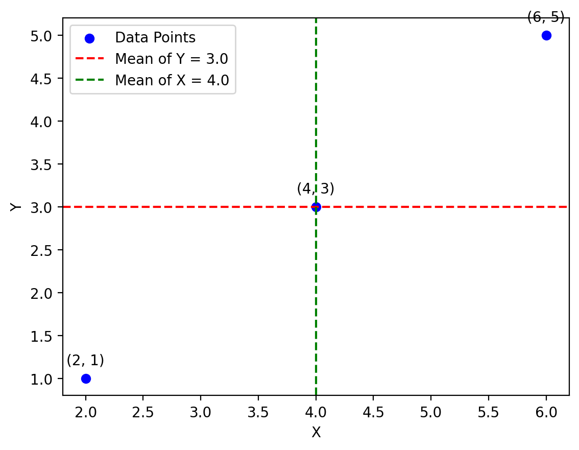
# Define two arrays of 3 points each
x = np.array([2, 4, 6])
y = np.array([1, 3, 5])
# Calculate means
mean_x = np.mean(x)
mean_y = np.mean(y)
# Create the plot
fig, ax = plt.subplots()
ax.scatter(x, y, label='Data Points', color='b')
ax.axhline(mean_y, color='r', linestyle='--', label=f'Mean of Y = {mean_y}')
ax.axvline(mean_x, color='g', linestyle='--', label=f'Mean of X = {mean_x}')
# Annotate individual points
for i, (xi, yi) in enumerate(zip(x, y)):
ax.annotate(f'({xi}, {yi})', (xi, yi), textcoords="offset points", xytext=(0,10), ha='center')
# Add labels and legend
ax.set_xlabel('X')
ax.set_ylabel('Y')
ax.legend()
plt.show()
import numpy as np
import matplotlib.pyplot as plt
import panel as pn
import param
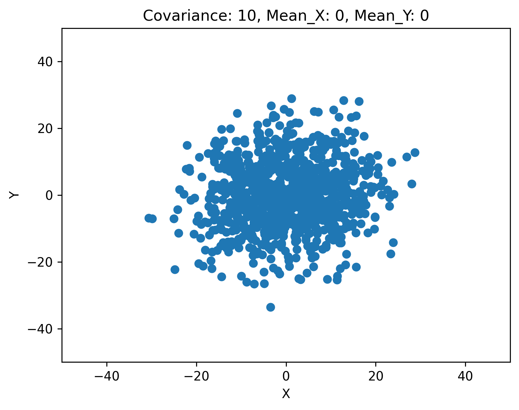
class CovariancePlot(param.Parameterized):
cov = param.Number(10, bounds=(-50, 50))
mean_x = param.Number(0, bounds=(-10, 10))
mean_y = param.Number(0, bounds=(-10, 10))
def plot(self):
np.random.seed(0)
N = 1000
cov_matrix = [[100, self.cov],
[self.cov, 100]]
X, Y = np.random.multivariate_normal([self.mean_x, self.mean_y], cov_matrix, N).T
fig, ax = plt.subplots()
ax.scatter(X, Y)
ax.set_xlim(-50, 50)
ax.set_ylim(-50, 50)
ax.set_title(f'Covariance: {self.cov}, Mean_X: {self.mean_x}, Mean_Y: {self.mean_y}')
plt.xlabel('X')
plt.ylabel('Y')
return fig
cov_plot = CovariancePlot()
pn.Row(pn.Param(cov_plot.param, widgets={'cov': pn.widgets.FloatSlider, 'mean_x': pn.widgets.FloatSlider, 'mean_y': pn.widgets.FloatSlider}),
pn.panel(cov_plot.plot))
5.3.2. Central Park data#
fig, ax = plt.subplots()
ax.scatter(ds_cp["temp_min"], ds_cp["temp_max"], s=1)
ax.set_xlabel("min temp. [F]")
ax.set_ylabel("max temp. [F]")
Text(0, 0.5, 'max temp. [F]')
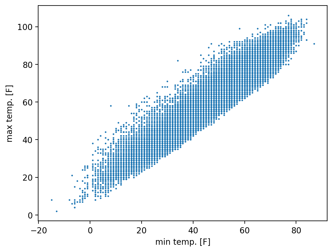
float(xr.cov(
    ds_cp["temp_min"],
    ds_cp["temp_max"]))
302.73222593210903
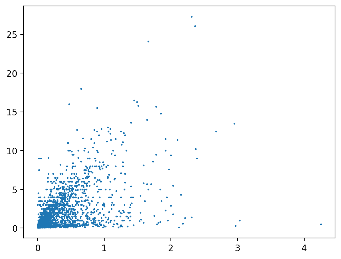
import puffins as pf
pf.stats.lin_regress(ds_cp["precip"].where(ds_cp["snow_fall"] > 0, drop=True), ds_cp["snow_fall"].where(
    ds_cp["snow_fall"] > 0, drop=True), "time").sel(parameter="r_value")
<xarray.DataArray ()>
array(0.53028817)
Coordinates:
parameter <U9 'r_value'fig, ax = plt.subplots()
ax.scatter(ds_cp["precip"], ds_cp["snow_fall"].where(ds_cp["snow_fall"] > 0), s=1)
<matplotlib.collections.PathCollection at 0x173cfe910>
5.4. Correlation#
Covariance provides a dimensional, quantitative measure of how much two variables tend to vary in sync with one another. But it is impossible to directly compare the covariance between pairs of variables that do not have the same pysical dimensions.
Correlation provides a dimensionless measure of how closely related two variables are, and one that can be
5.4.1. Pearson correlation coefficient (\(r\))#
In essence, the Pearson correlation coefficient is simply the covariance between two variables, but then normalized by the product of each variable’s individual variance.
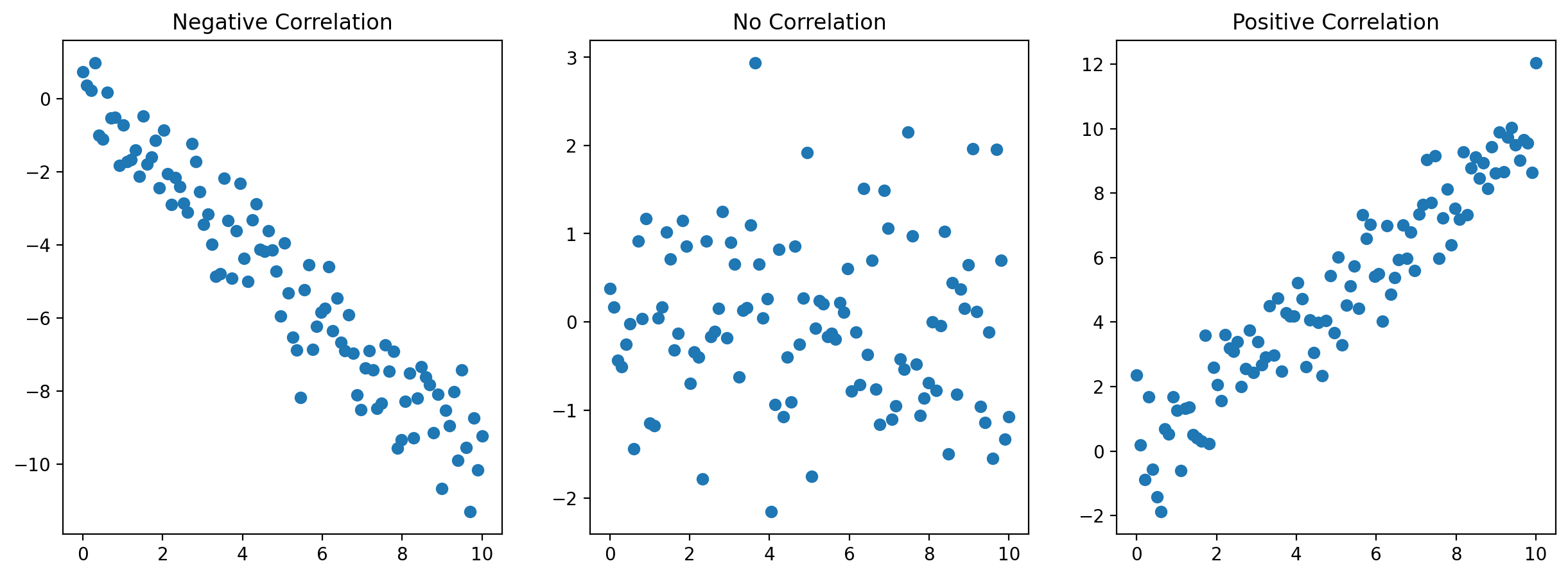
# Scatter Plots for Different Pearson Coefficients
fig, axs = plt.subplots(1, 3, figsize=(15, 5))
# Negative Correlation
x1 = np.linspace(0, 10, 100)
y1 = -x1 + np.random.normal(0, 1, 100)
axs[0].scatter(x1, y1)
axs[0].set_title('Negative Correlation')
# No Correlation
y2 = np.random.normal(0, 1, 100)
axs[1].scatter(x1, y2)
axs[1].set_title('No Correlation')
# Positive Correlation
y3 = x1 + np.random.normal(0, 1, 100)
axs[2].scatter(x1, y3)
axs[2].set_title('Positive Correlation')
plt.show()
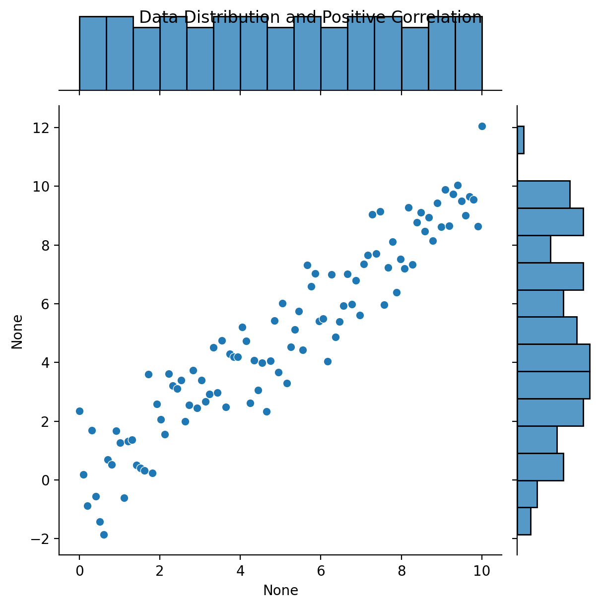
# Data Distribution and Correlation using Seaborn
sns.jointplot(x=x1, y=y3, kind="scatter", marginal_kws=dict(bins=15))
plt.suptitle('Data Distribution and Positive Correlation')
plt.show()
import panel as pn
import numpy as np
import matplotlib.pyplot as plt
from scipy.stats import pearsonr

pn.extension()

def plot_with_correlation(r=0):
    # Create synthetic data
    np.random.seed(42)
    n = 1000
    x = np.random.randn(n)
    noise = np.random.randn(n)
    y = r*x + np.sqrt(1-r**2)*noise

    # Compute and print actual correlation
    actual_corr, _ = pearsonr(x, y)

    # Plotting
    fig, ax = plt.subplots()
    ax.scatter(x, y)
    ax.set_title(f"Actual Pearson correlation: {actual_corr:.2f}")
    plt.xlabel('X')
    plt.ylabel('Y')
    plt.xlim([-4, 4])
    plt.ylim([-4, 4])
    plt.grid(True)
    plt.close(fig)
    return fig

correlation_slider = pn.widgets.FloatSlider(name='Correlation Coefficient', start=-1, end=1, step=0.01, value=0)
interactive_plot = pn.interact(plot_with_correlation, r=correlation_slider)
pn.Column("# Interactive Correlation Coefficient Example", interactive_plot).servable()
import numpy as np
import matplotlib.pyplot as plt
import panel as pn

pn.extension()

def plot_correlated_data(correlation=0.0, x_scale=1.0, y_scale=1.0, x_offset=0.0, y_offset=0.0):
    np.random.seed(0)
    N = 100
    x = np.random.randn(N)
    x_transformed = x_scale * (x - x_offset)
    noise = np.random.randn(N)
    y = correlation * x_transformed + np.sqrt(1 - correlation ** 2) * noise
    y_transformed = y_scale * (y + y_offset)

    actual_corr, _ = pearsonr(x_transformed, y_transformed)

    fig, ax = plt.subplots(figsize=(6, 4))
    ax.scatter(x_transformed, y_transformed)
    ax.set_title(f"Actual Pearson correlation: {actual_corr:.2f}")
    ax.set_xlim(-4, 4)
    ax.set_ylim(-10, 10)
    ax.grid(True)
    plt.close(fig)
    return fig

correlation_slider = pn.widgets.FloatSlider(start=-1.0, end=1.0, step=0.01, value=0.0, name='Correlation')
x_scale_slider = pn.widgets.FloatSlider(start=0.1, end=5.0, step=0.1, value=1.0, name='x scale')
y_scale_slider = pn.widgets.FloatSlider(start=0.1, end=5.0, step=0.1, value=1.0, name='y scale')
x_offset_slider = pn.widgets.FloatSlider(start=-5.0, end=5.0, step=0.1, value=0.0, name='x offset')
y_offset_slider = pn.widgets.FloatSlider(start=-5.0, end=5.0, step=0.1, value=0.0, name='y offset')

#interactive_plot = pn.interact(plot_correlated_data, correlation=correlation_slider)
interactive_plot = pn.interact(
    plot_correlated_data,
    correlation=correlation_slider,
    x_scale=x_scale_slider,
    y_scale=y_scale_slider,
    x_offset=x_offset_slider,
    y_offset=y_offset_slider,
)

pn.Column("# Correlation coefficient", interactive_plot).servable()
5.4.1.1. Limitations#
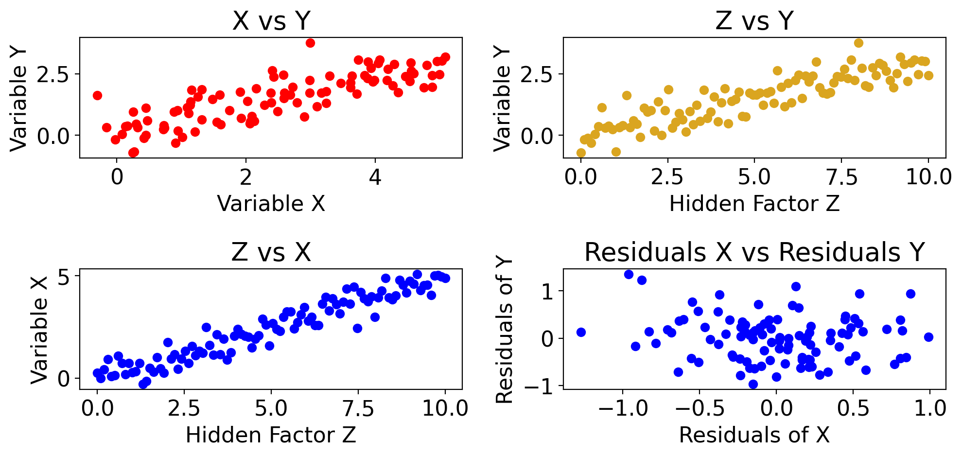
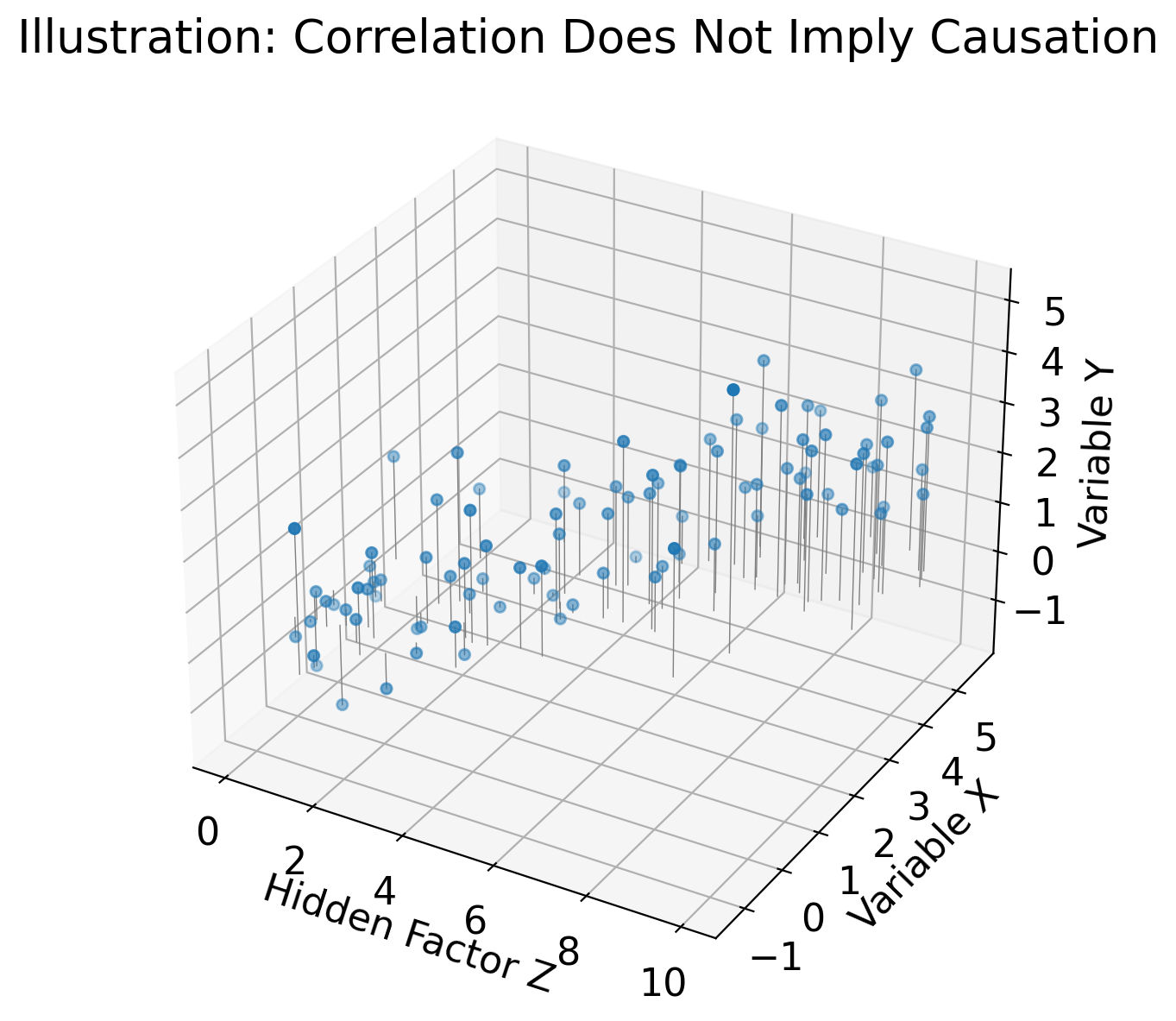
Correlation does not imply causation: 3rd variable could be driving both#
import matplotlib.pyplot as plt
import numpy as np

# Generate synthetic data
np.random.seed(42)
Z = np.linspace(0, 10, 100)  # Z is the hidden factor that affects both X and Y
X = 0.5 * Z + 0.5*np.random.normal(size=Z.size)  # X is somewhat influenced by Z
Y = 0.3 * Z + 0.5*np.random.normal(size=Z.size)  # Y is also somewhat influenced by Z

# Fit linear models to get residuals
model_X = LinearRegression()
model_X.fit(Z.reshape(-1, 1), X)
residuals_X = X - model_X.predict(Z.reshape(-1, 1))

model_Y = LinearRegression()
model_Y.fit(Z.reshape(-1, 1), Y)
residuals_Y = Y - model_Y.predict(Z.reshape(-1, 1))


# Plotting
fig, axs = plt.subplots(2, 2, figsize=(10, 5))

# Scatter plot for X vs Y showing the apparent correlation
ax = axs[0,0]
ax.scatter(X, Y, color='red')
ax.set_xlabel('Variable X')
ax.set_ylabel('Variable Y')
ax.set_title('X vs Y')

# Scatter plot for Z vs X
ax = axs[1,0]
ax.scatter(Z, X, color='blue')
ax.set_xlabel('Hidden Factor Z')
ax.set_ylabel('Variable X')
ax.set_title('Z vs X')

# Scatter plot for Z vs Y
ax = axs[0,1]
ax.scatter(Z, Y, color='goldenrod')
ax.set_xlabel('Hidden Factor Z')
ax.set_ylabel('Variable Y')
ax.set_title('Z vs Y')

# Scatter plot for Residuals X vs Residuals Y
ax = axs[1,1]
ax.scatter(residuals_X, residuals_Y, color='blue')
ax.set_xlabel('Residuals of X')
ax.set_ylabel('Residuals of Y')
ax.set_title('Residuals X vs Residuals Y')

plt.tight_layout()
plt.show()
import matplotlib.pyplot as plt
import numpy as np
from sklearn.linear_model import LinearRegression

# Generate synthetic data
np.random.seed(42)
Z = np.linspace(0, 10, 100)  # Z is the hidden factor that affects both X and Y
X = 0.5 * Z + 0.5*np.random.normal(size=Z.size)  # X is somewhat influenced by Z
Y = 0.3 * Z + 0.5*np.random.normal(size=Z.size)  # Y is also somewhat influenced by Z

# Fit linear models to get residuals
model_X = LinearRegression()
model_X.fit(Z.reshape(-1, 1), X)
residuals_X = X - model_X.predict(Z.reshape(-1, 1))

model_Y = LinearRegression()
model_Y.fit(Z.reshape(-1, 1), Y)
residuals_Y = Y - model_Y.predict(Z.reshape(-1, 1))

# Plotting
fig, axs = plt.subplots(1, 2, figsize=(10, 4))

# Scatter plot for X vs Y
axs[0].scatter(X, Y, color='red')
axs[0].set_xlabel('Variable X')
axs[0].set_ylabel('Variable Y')
axs[0].set_title('X vs Y')

# Scatter plot for Residuals X vs Residuals Y
axs[1].scatter(residuals_X, residuals_Y, color='blue')
axs[1].set_xlabel('Residuals of X')
axs[1].set_ylabel('Residuals of Y')
axs[1].set_title('Residuals X vs Residuals Y')

plt.tight_layout()
plt.show()
import matplotlib.pyplot as plt
import numpy as np
from mpl_toolkits.mplot3d import Axes3D

# Generate synthetic data
np.random.seed(42)
Z = np.linspace(0, 10, 100)  # Z is the hidden factor that affects both X and Y
X = 0.5 * Z + np.random.normal(size=Z.size)  # X is somewhat influenced by Z
Y = 0.3 * Z + np.random.normal(size=Z.size)  # Y is also somewhat influenced by Z

# Create a 3D scatter plot
fig = plt.figure(figsize=(10, 7))
ax = fig.add_subplot(111, projection='3d')

# Scatter plot
scatter = ax.scatter(Z, X, Y)

# Labels and title
ax.set_xlabel('Hidden Factor Z')
ax.set_ylabel('Variable X')
ax.set_zlabel('Variable Y')
ax.set_title('Illustration: Correlation Does Not Imply Causation')

# Draw lines projecting the points onto the Z=0 plane
for zi, xi, yi in zip(Z, X, Y):
    ax.plot([zi, zi], [xi, xi], [0, yi], 'gray', lw=0.5)

plt.show()
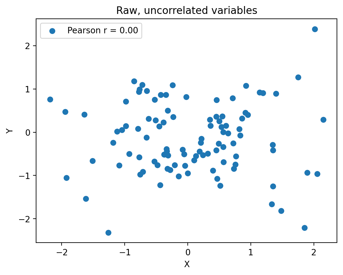
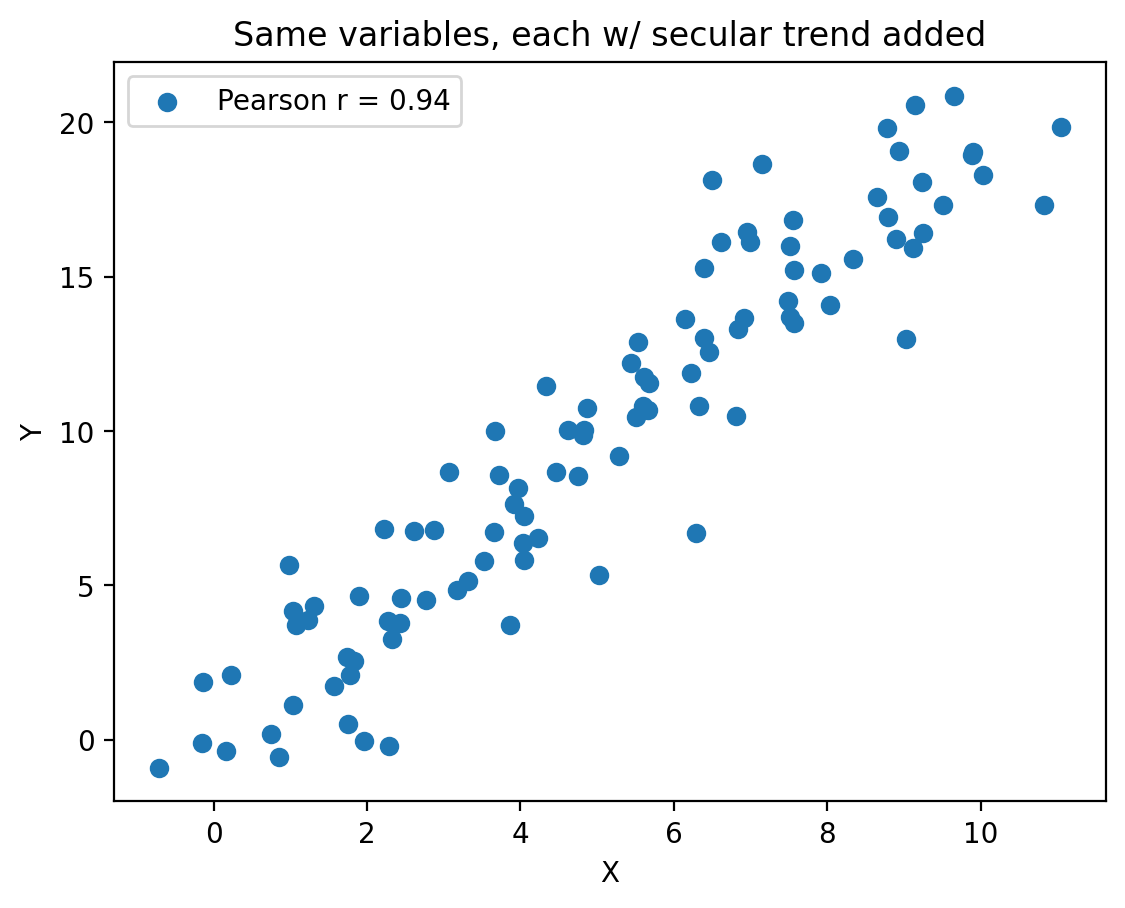
Secular trends#
import numpy as np
import matplotlib.pyplot as plt

np.random.seed(13)

# Generate uncorrelated random data
N = 100
x_random = np.random.randn(N)
y_random = np.random.randn(N)

# Generate a linear trend
x_trend = 0
y_trend = 0

# Add the trend to the random data
x = x_random + x_trend
y = y_random + y_trend

# Calculate the Pearson correlation coefficient
correlation = np.corrcoef(x, y)[0, 1]

# Create the plot
fig, ax = plt.subplots()
ax.scatter(x, y, label=f'Pearson r = {correlation:.2f}')
ax.set_xlabel('X')
ax.set_ylabel('Y')
plt.title("Raw, uncorrelated variables")
ax.legend()

plt.show()
import numpy as np
import matplotlib.pyplot as plt

np.random.seed(13)

# Generate uncorrelated random data
N = 100
x_random = np.random.randn(N)
y_random = np.random.randn(N)

# Generate a linear trend
x_trend = np.linspace(0, 10, N)
y_trend = np.linspace(0, 20, N)

# Add the trend to the random data
x = x_random + x_trend
y = y_random + y_trend

# Calculate the Pearson correlation coefficient
correlation = np.corrcoef(x, y)[0, 1]

# Create the plot
fig, ax = plt.subplots()
ax.scatter(x, y, label=f'Pearson r = {correlation:.2f}')
ax.set_xlabel('X')
ax.set_ylabel('Y')
plt.title('Same variables, each w/ secular trend added')
ax.legend()

plt.show()
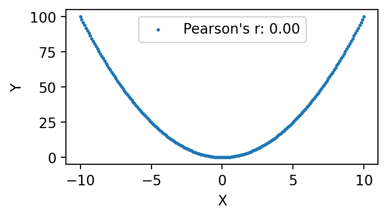
Non-monotonic relationships#
import matplotlib.pyplot as plt
import numpy as np

# Generate x values symmetrically around zero
x = np.linspace(-10, 10, 200)

# Compute y values based on x^2
y = x**2

# Compute Pearson's r
r = np.corrcoef(x, y)[0, 1]

# Plot the data
plt.figure(figsize=(4, 2))
plt.scatter(x, y, label=f"Pearson's r: {r:.2f}", s=2)
plt.xlabel('X')
plt.ylabel('Y')
plt.title('')
plt.legend()
#plt.grid(True)
plt.show()
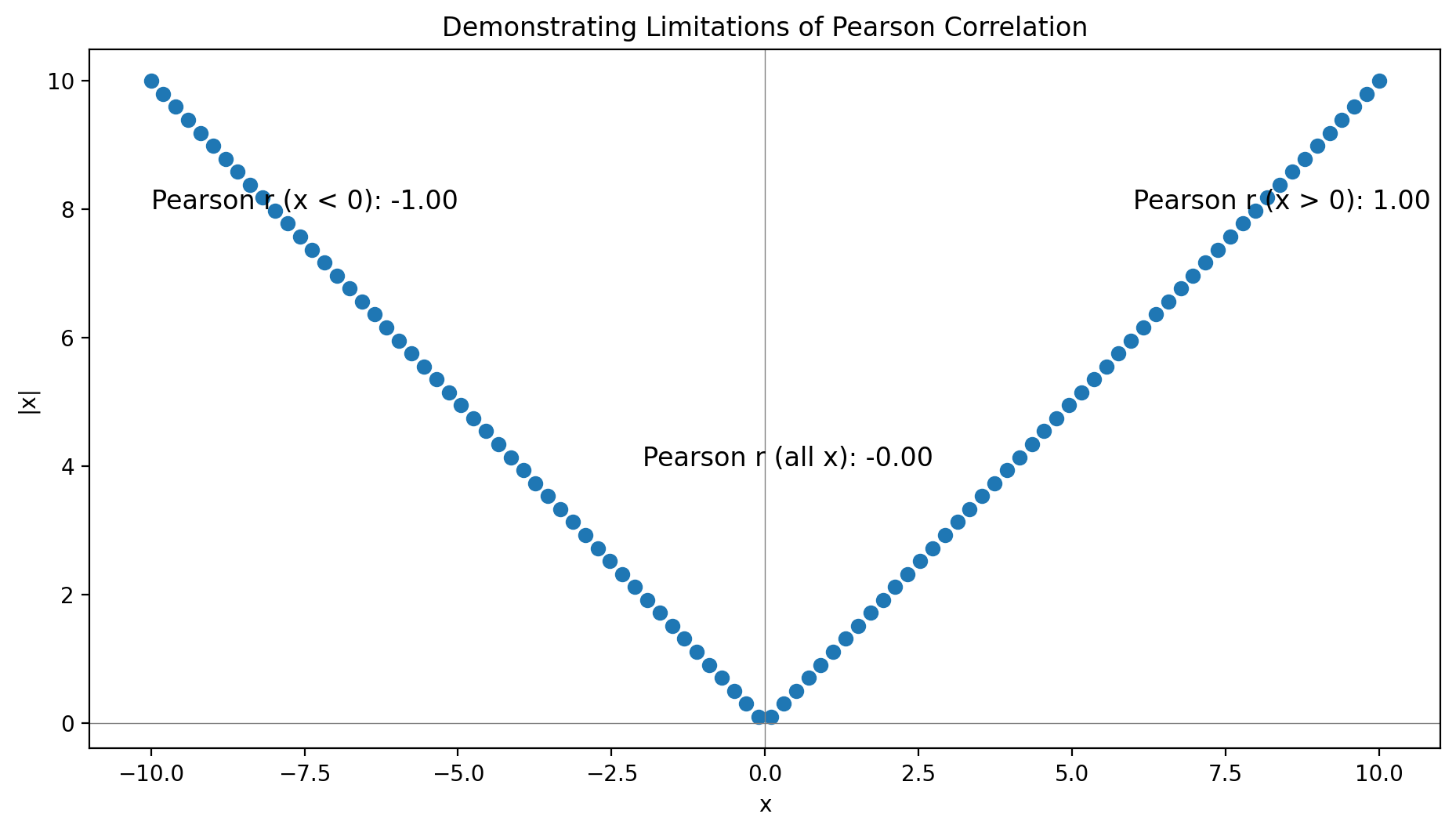
import matplotlib.pyplot as plt
import numpy as np
from scipy.stats import pearsonr

# Generate data
np.random.seed(0)
x = np.linspace(-10, 10, 100)
y = np.abs(x)

# Compute correlations
r_all = pearsonr(x, y)[0]
r_pos = pearsonr(x[x > 0], y[x > 0])[0]
r_neg = pearsonr(x[x < 0], y[x < 0])[0]

# Create plot
fig, ax = plt.subplots(figsize=(9.6, 5.4))
ax.scatter(x, y, label='Data Points')
ax.axhline(0, color='gray', lw=0.5)
ax.axvline(0, color='gray', lw=0.5)

# Annotate with correlation values
ax.text(6, 8, f"Pearson r (x > 0): {r_pos:.2f}", fontsize=12)
ax.text(-10, 8, f"Pearson r (x < 0): {r_neg:.2f}", fontsize=12)
ax.text(-2, 4, f"Pearson r (all x): {r_all:.2f}", fontsize=12)

ax.set_xlabel('x')
ax.set_ylabel('|x|')
ax.set_title('Demonstrating Limitations of Pearson Correlation')
plt.tight_layout()
plt.show()
Random chance#
import numpy as np
import matplotlib.pyplot as plt

#np.random.seed(0)

N = 10  # Number of points in each sample
M = 100  # Number of repeated experiments

max_corr = 0
max_x, max_y = None, None

for _ in range(M):
    x_random = np.random.randn(N)
    y_random = np.random.randn(N)

    corr = np.abs(np.corrcoef(x_random, y_random)[0, 1])

    if corr > max_corr:
        max_corr = corr
        max_x = x_random
        max_y = y_random

# Plot the data points that resulted in the highest magnitude correlation
fig, ax = plt.subplots()
ax.scatter(max_x, max_y, label=f'r = {max_corr:.3f}')
ax.set_xlabel('X')
ax.set_ylabel('Y')
ax.legend()
#plt.title('Spurious Correlation from Random Samples')

plt.show()
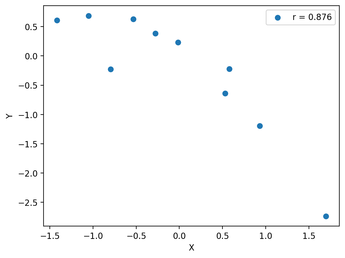
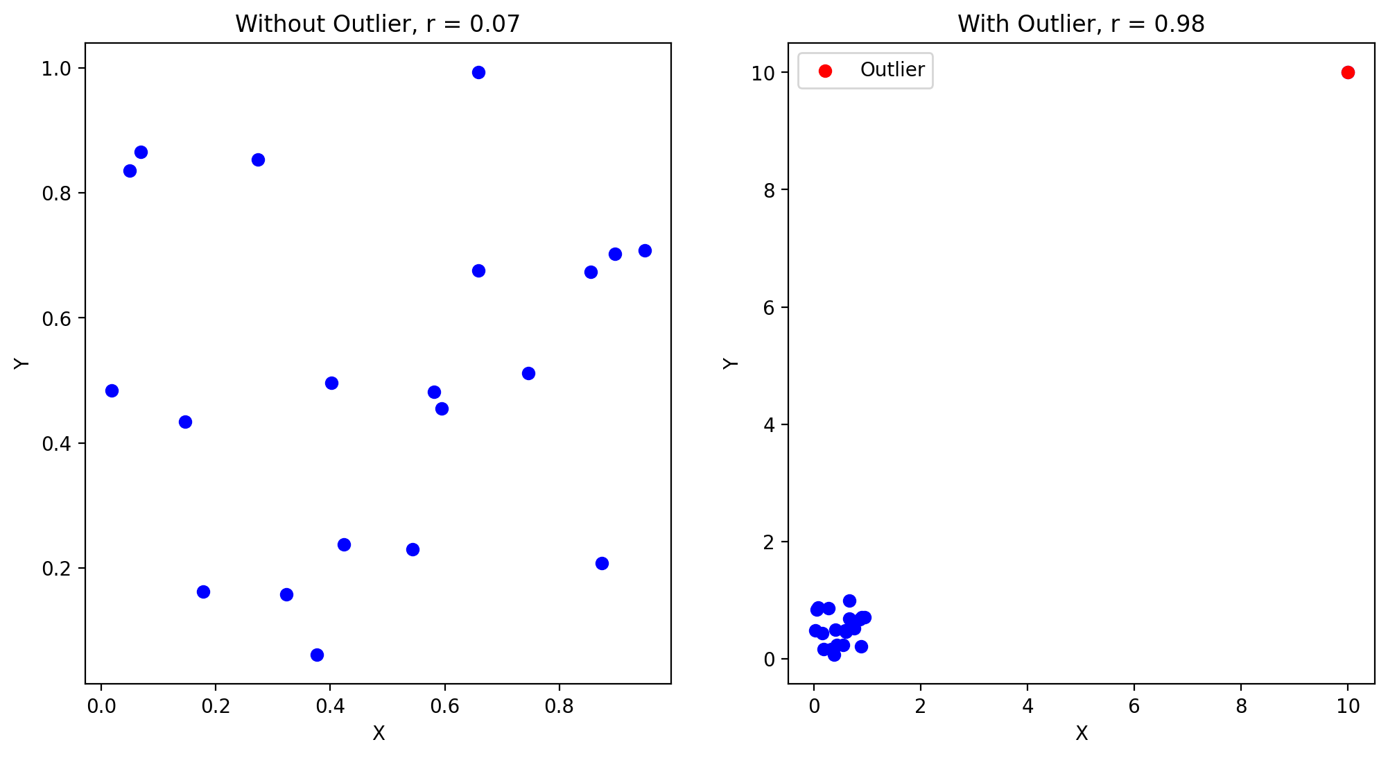
Sensitivitiy to outliers#
import matplotlib.pyplot as plt
import numpy as np
import scipy.stats

# Generate independent arrays
x = np.random.rand(20)
y = np.random.rand(20)

# Compute the initial Pearson correlation
r_initial, _ = scipy.stats.pearsonr(x, y)

# Add an outlier
x_outlier = np.append(x, [10])
y_outlier = np.append(y, [10])

# Compute the new Pearson correlation with the outlier
r_outlier, _ = scipy.stats.pearsonr(x_outlier, y_outlier)

# Create the plot
fig, (ax1, ax2) = plt.subplots(1, 2, figsize=(12, 6))

# Plot without outlier
ax1.scatter(x, y, color='b')
ax1.set_title(f'Without Outlier, r = {r_initial:.2f}')
ax1.set_xlabel('X')
ax1.set_ylabel('Y')

# Plot with outlier
ax2.scatter(x_outlier, y_outlier, color='b')
ax2.scatter(10, 10, color='r', label='Outlier')
ax2.set_title(f'With Outlier, r = {r_outlier:.2f}')
ax2.set_xlabel('X')
ax2.set_ylabel('Y')
ax2.legend()

plt.show()
5.4.1.2. Hypothesis test for Pearson’s \(r\)#
from scipy import stats
import numpy as np

# Sample data
np.random.seed(0)
x = np.random.randn(30)
y = 2 * x + np.random.randn(30)

# Compute Pearson correlation
r, _ = stats.pearsonr(x, y)

# Compute t-statistic
N = len(x)
t_statistic = (r * np.sqrt(N - 2)) / np.sqrt(1 - r**2)

# Degrees of freedom
df = N - 2

# Compute p-value
p_value = 2 * (1 - stats.t.cdf(np.abs(t_statistic), df))

print(f"r: {r}, t-statistic: {t_statistic}, p-value: {p_value}")
print(stats.pearsonr(x, y))
r: 0.913518817273365, t-statistic: 11.88281496322004, p-value: 1.8771650900362147e-12
PearsonRResult(statistic=0.913518817273365, pvalue=1.8771534139207052e-12)
While Pearson’s correlation coefficient \(r\) itself makes no assumptions about the distributions of the two variables, the hypothesis test for \(r\) assumes that each variable’s population is Gaussian.
As always, the concern about normality becomes more relaxed with larger samples due to the central limit theorem. However, with small samples, deviations from normality can distort the test statistics and p-values, increasing the likelihood of false positives (i.e. “Type I errors”).
import numpy as np
from scipy.stats import pearsonr, norm, uniform

# Set random seed for reproducibility
seed = np.random.randint(0, 2**32 - 1)
seed2 = np.random.randint(0, 2**32 - 1)

np.random.seed(seed)

# Number of samples
N = 1000

# Specified correlation
rho = 0.1

# Generate normal-distributed variables with specified correlation
np.random.seed(seed)
normal_x = norm.rvs(size=N)
np.random.seed(seed2)
norm2 = norm.rvs(size=N)
normal_y = rho * normal_x + np.sqrt(1 - rho**2) * norm2
r_normal, p_normal = pearsonr(normal_x, normal_y)


# Generate uniform-distributed variables with specified correlation
np.random.seed(seed)
uniform_x = uniform.rvs(size=N)
np.random.seed(seed2)
unif2 = uniform.rvs(size=N)
uniform_y = rho * uniform_x + np.sqrt(1 - rho**2) * unif2
r_uniform, p_uniform = pearsonr(uniform_x, uniform_y)

print(f"Normal distribution: r = {r_normal:.4f}, p-value = {p_normal:.2e}")
print(f"Uniform distribution: r = {r_uniform:.4f}, p-value = {p_uniform:.2e}")
Normal distribution: r = 0.1326, p-value = 2.61e-05
Uniform distribution: r = 0.1341, p-value = 2.09e-05
5.4.1.3. Central Park data#
fig, ax = plt.subplots()
ax.scatter(ds_cp["temp_min"], ds_cp["temp_max"], s=1)
ax.set_xlabel("min temp. [F]")
ax.set_ylabel("max temp. [F]")
Text(0, 0.5, 'max temp. [F]')
float(xr.corr(
    ds_cp["temp_min"],
    ds_cp["temp_max"]))
0.9537972358424263
pf.stats.corr_detrended(
    ds_cp["temp_min"],
    ds_cp["temp_max"])
0.9535715950209205
5.4.2. Spearman’s rank correlation coefficient#
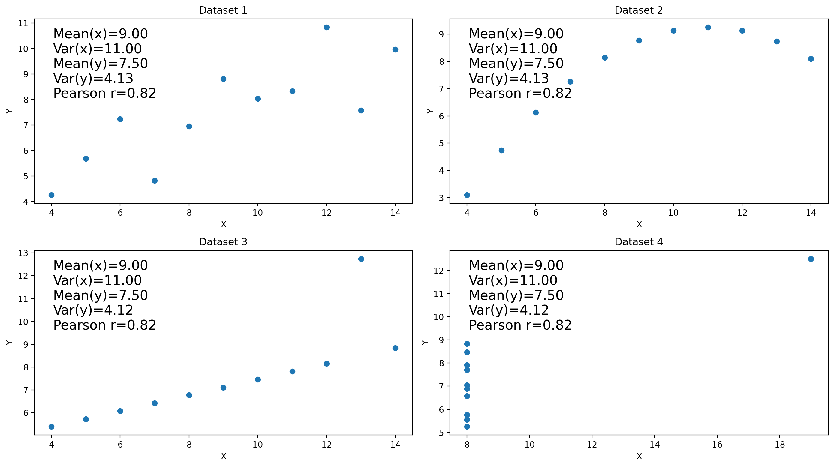
5.5. Anscombe’s quartet#
import matplotlib.pyplot as plt
import numpy as np
from scipy.stats import pearsonr

# Data for Anscombe's quartet
x1 = np.array([10, 8, 13, 9, 11, 14, 6, 4, 12, 7, 5])
y1 = np.array([8.04, 6.95, 7.58, 8.81, 8.33, 9.96, 7.24, 4.26, 10.84, 4.82, 5.68])
x2 = x1
y2 = np.array([9.14, 8.14, 8.74, 8.77, 9.26, 8.10, 6.13, 3.10, 9.13, 7.26, 4.74])
x3 = x1
y3 = np.array([7.46, 6.77, 12.74, 7.11, 7.81, 8.84, 6.08, 5.39, 8.15, 6.42, 5.73])
x4 = np.array([8, 8, 8, 8, 8, 8, 8, 19, 8, 8, 8])
y4 = np.array([6.58, 5.76, 7.71, 8.84, 8.47, 7.04, 5.25, 12.50, 5.56, 7.91, 6.89])


# Define datasets
datasets = {
    "Dataset 1": (x1, y1),
    "Dataset 2": (x2, y2),
    "Dataset 3": (x3, y3),
    "Dataset 4": (x4, y4)
}

# Create 2x2 subplots
fig, axs = plt.subplots(2, 2, figsize=(14, 7.875))
axs = axs.flatten()

# Loop through datasets to plot each
for i, (title, (x, y)) in enumerate(datasets.items()):
    ax = axs[i]
    ax.scatter(x, y)

    # Compute summary statistics
    mean_x, mean_y = np.mean(x), np.mean(y)
    var_x, var_y = np.var(x, ddof=1), np.var(y, ddof=1)
    r, _ = pearsonr(x, y)

    # Annotate the plot with these statistics
    stats_text = f"Mean(x)={mean_x:.2f}\nVar(x)={var_x:.2f}\nMean(y)={mean_y:.2f}\nVar(y)={var_y:.2f}\nPearson r={r:.2f}"
    ax.text(0.05, 0.95, stats_text, transform=ax.transAxes, verticalalignment='top', fontsize=16)
    ax.set_title(title)
    ax.set_xlabel('X')
    ax.set_ylabel('Y')

# Show plot
plt.tight_layout()
plt.show()
5.6. Linear regression#
Linear regression makes the following assumptions:
Linearity: the independent and dependent variables are linearly related. Applying linear regression for variables with nonlinear relationships can lead to errant predictions.
Independence: Each value of the independent variable is assumed independent of all its other values, and each value of the dependent variable is assumed independent of all its other values. For time series or spatial data, this assumption can be violated, leading to biased or inefficient parameter estimates.
Homoscedasticity: The variance of the residuals is constant across all levels of the independent variable. When this doesn’t occur, it’s called heteroscedastic, whic can lead to inefficient parameter estimates and incorrect conclusions from hypothesis tests.
Normality of Errors: Not for linear regression itself, but for hypothesis testing.
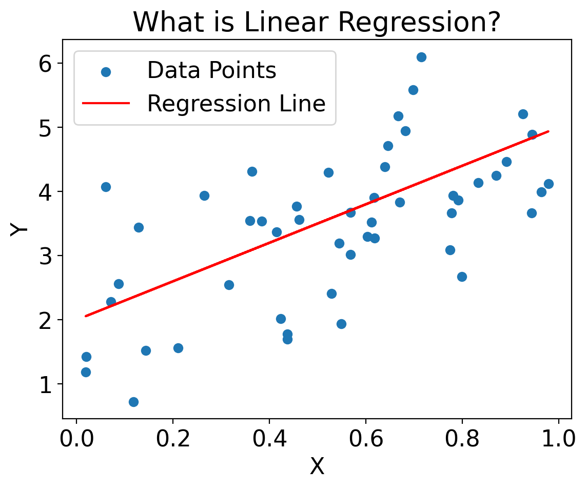
import matplotlib.pyplot as plt
import numpy as np

np.random.seed(0)
X = np.random.rand(50)
Y = 2 + 3 * X + np.random.randn(50)

plt.scatter(X, Y, label='Data Points')
plt.plot(X, 2 + 3 * X, label='Regression Line', color='red')
plt.xlabel('X')
plt.ylabel('Y')
plt.legend()
plt.title('What is Linear Regression?')
plt.show()
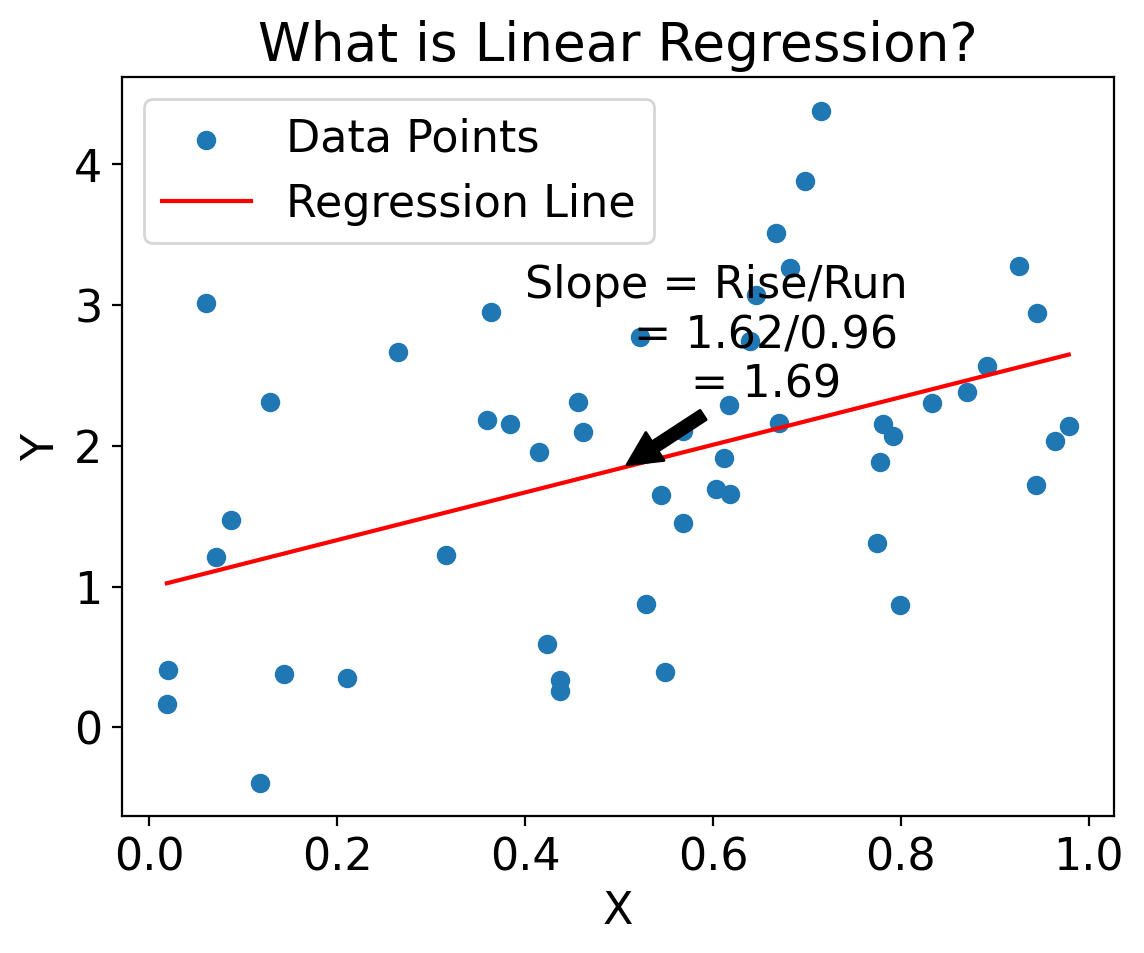
import matplotlib.pyplot as plt
import numpy as np
from sklearn.linear_model import LinearRegression

# Generate some synthetic data
np.random.seed(0)
X = np.random.rand(50)
Y = 2 * X + 1 + np.random.randn(50)

# Fit a simple linear model
model = LinearRegression()
model.fit(X.reshape(-1, 1), Y)
line_X = np.linspace(min(X), max(X), 100).reshape(-1, 1)
line_y = model.predict(line_X)

# Calculate rise and run for annotation
rise = float(line_y[-1] - line_y[0])
run = float(line_X[-1] - line_X[0])
slope = rise / run

# Create the plot
plt.scatter(X, Y, label='Data Points')
plt.plot(line_X, line_y, label='Regression Line', color='red')

# Annotate slope on the line
mid_point_index = len(line_X) // 2
mid_point_X = line_X[mid_point_index]
mid_point_y = model.predict(mid_point_X.reshape(1, -1))
plt.annotate(
    f'Slope = Rise/Run\n       = {rise:.2f}/{run:.2f}\n       = {slope:.2f}',
    xy=(mid_point_X[0], mid_point_y[0]),
    xytext=(mid_point_X[0] + 0.1, mid_point_y[0] + 0.5),
    arrowprops=dict(facecolor='black', shrink=0.05),
    horizontalalignment='center'
)

plt.xlabel('X')
plt.ylabel('Y')
plt.legend()
plt.title('What is Linear Regression?')
plt.show()
/var/folders/3g/s0brcg452zn0z3962qt_0pn00000gn/T/ipykernel_10782/161289806.py:18: DeprecationWarning: Conversion of an array with ndim > 0 to a scalar is deprecated, and will error in future. Ensure you extract a single element from your array before performing this operation. (Deprecated NumPy 1.25.)
  run = float(line_X[-1] - line_X[0])
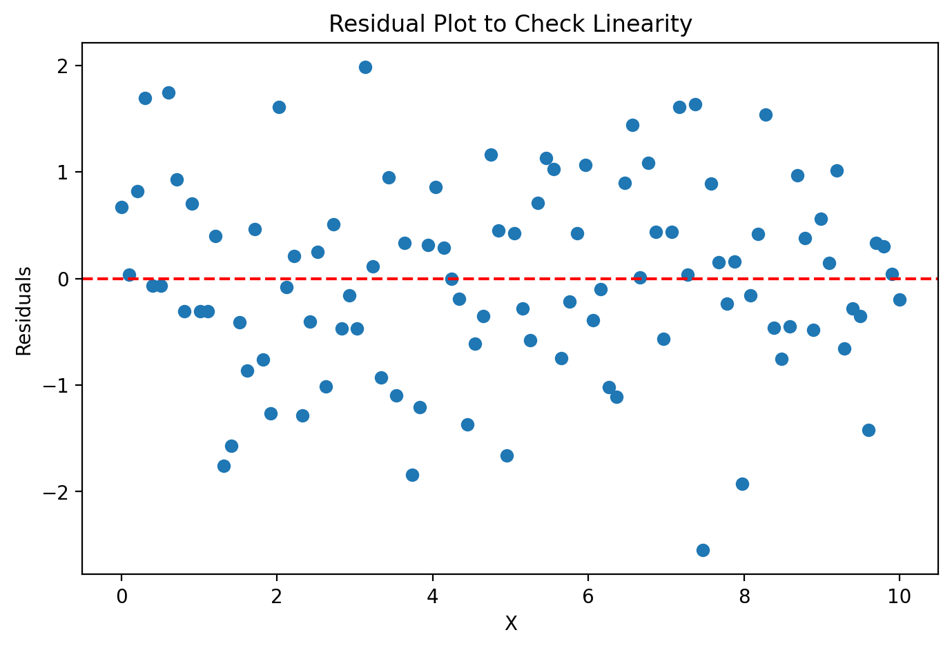
5.6.1. Residuals#
import matplotlib.pyplot as plt
import numpy as np

# Generate synthetic data
np.random.seed(42)
X = np.linspace(0, 10, 100)
y = 2 * X + 1 + np.random.normal(0, 1, 100)

# Fit a simple linear model
coeff = np.polyfit(X, y, 1)
y_pred = np.polyval(coeff, X)

# Calculate residuals
residuals = y - y_pred

# Create residual plot
plt.figure(figsize=(8, 5))
plt.scatter(X, residuals)
plt.axhline(0, color='r', linestyle='--')
plt.xlabel("X")
plt.ylabel("Residuals")
plt.title("Residual Plot to Check Linearity")
plt.show()
import panel as pn
import pandas as pd
from bokeh.models import Span
from bokeh.plotting import figure

# Create DataFrame
df = pd.DataFrame({'X': X, 'residuals': residuals})

# Define the plotting function
def plot_with_smoothing(smoothing):
    p = figure(width=800, height=400, title='Residual Plot with Smoothing Curve')
    p.scatter(df['X'], df['residuals'], color='blue')
    if smoothing:
        p.line(df['X'], df['residuals'].rolling(window=5).mean(), color='green', legend_label='Smoothing Curve')
    hline = Span(location=0, dimension='width', line_color='red', line_dash='dashed')
    p.renderers.extend([hline])
    return p

# Create Panel interactive widget
smoothing_toggle = pn.widgets.Toggle(name='Add Smoothing Curve', value=False)
interact = pn.interact(plot_with_smoothing, smoothing=smoothing_toggle)
pn.Row(interact[1][0], interact[0]).servable()
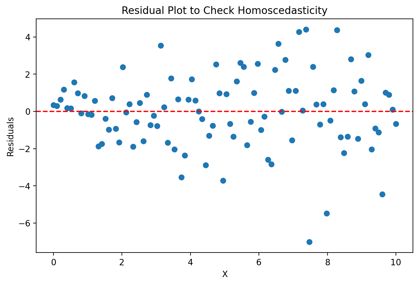
5.6.2. Homeskedasticity#
import matplotlib.pyplot as plt
import numpy as np

# Generate synthetic data
np.random.seed(42)
X = np.linspace(0, 10, 100)
y = 2 * X + 1 + np.random.normal(0, np.sqrt(X), 100)

# Fit a simple linear model
coeff = np.polyfit(X, y, 1)
y_pred = np.polyval(coeff, X)

# Calculate residuals
residuals = y - y_pred

# Create residual plot
plt.figure(figsize=(8, 5))
plt.scatter(X, residuals)
plt.axhline(0, color='r', linestyle='--')
plt.xlabel("X")
plt.ylabel("Residuals")
plt.title("Residual Plot to Check Homoscedasticity")
plt.show()
import panel as pn
import pandas as pd
from bokeh.models import Span
from bokeh.plotting import figure

# Define the plotting function
def plot_homoscedasticity(constant_variance=True):
    np.random.seed(42)
    if constant_variance:
        y = 2 * X + 1 + np.random.normal(0, 1, 100)
    else:
        y = 2 * X + 1 + np.random.normal(0, np.sqrt(X), 100)

    # Calculate residuals
    coeff = np.polyfit(X, y, 1)
    y_pred = np.polyval(coeff, X)
    residuals = y - y_pred

    # Create Bokeh plot
    p = figure(width=800, height=400, title='Residual Plot to Check Homoscedasticity')
    p.scatter(X, residuals, color='blue')
    hline = Span(location=0, dimension='width', line_color='red', line_dash='dashed')
    p.renderers.extend([hline])
    return p

# Create Panel interactive widget
toggle = pn.widgets.Toggle(name='Constant Variance', value=True)
interact = pn.interact(plot_homoscedasticity, constant_variance=toggle)
pn.Row(interact[1][0], interact[0]).servable()
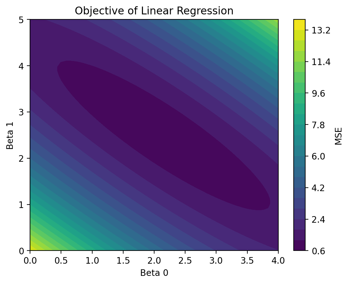
5.6.3. Least squares#
# Given the above X, Y
from sklearn.metrics import mean_squared_error

np.random.seed(0)
X = np.random.rand(50)
Y = 2 + 3 * X + np.random.randn(50)

beta_0 = np.linspace(0, 4, 50)
beta_1 = np.linspace(0, 5, 50)
mse_values = np.zeros((50, 50))

for i, b0 in enumerate(beta_0):
    for j, b1 in enumerate(beta_1):
        mse_values[i, j] = mean_squared_error(Y, b0 + b1 * X)

plt.contourf(beta_0, beta_1, mse_values, levels=20)
plt.colorbar(label='MSE')
plt.xlabel('Beta 0')
plt.ylabel('Beta 1')
plt.title('Objective of Linear Regression')
plt.show()
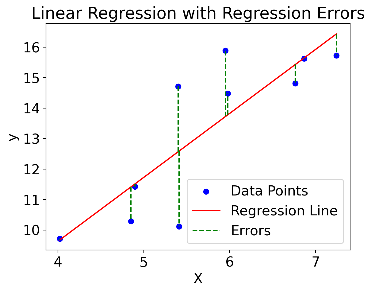
import matplotlib.pyplot as plt
import numpy as np
from sklearn.linear_model import LinearRegression

# Generate some synthetic data
np.random.seed(0)
X = np.random.normal(5, 1, 10).reshape(-1, 1)  # Independent variable
y = 2 * X.squeeze() + 1 + np.random.normal(0, 2, 10)  # Dependent variable

# Fit the linear regression model
model = LinearRegression()
model.fit(X, y)
line_X = np.linspace(min(X), max(X), 100).reshape(-1, 1)
line_y = model.predict(line_X)


# Plot the data points
plt.scatter(X, y, color='blue', label='Data Points')

# Plot the regression line
plt.plot(line_X, line_y, color='red', label='Regression Line')

# Calculate the y-values on the regression line
predicted_y = model.predict(X)

# Plot the errors as vertical lines
plt.vlines(X, predicted_y, y, colors='green', linestyles='dashed', label='Errors')

# Add labels and title
plt.xlabel('X')
plt.ylabel('y')
plt.title('Linear Regression with Regression Errors')
plt.legend()
plt.show()
import numpy as np
import holoviews as hv
import panel as pn
from sklearn.linear_model import LinearRegression
from sklearn.metrics import mean_squared_error

hv.extension('bokeh')

# Generate some synthetic data
np.random.seed(42)
X = np.random.rand(100) * 10
y = 2.5 * X + 10 + np.random.randn(100) * 5

# Fit a least squares linear regression model
X_reshaped = X.reshape(-1, 1)
model = LinearRegression()
model.fit(X_reshaped, y)

# Predict using the model
y_pred = model.predict(X_reshaped)
mse_least_squares = mean_squared_error(y, y_pred)

# Function to calculate the user-defined regression line and MSE
def regression_line(slope, intercept):
    user_y_pred = slope * X + intercept
    mse_user = mean_squared_error(y, user_y_pred)

    # Plot the data, least squares line, and user-defined line
    scatter = hv.Scatter((X, y), 'X', 'y')
    ls_line = hv.Curve((X, y_pred), 'X', 'y').opts(color='blue', line_width=2)
    user_line = hv.Curve((X, user_y_pred), 'X', 'y').opts(color='red', line_width=2)

    return (scatter * ls_line * user_line).opts(
        title=f'MSE (Least Squares): {mse_least_squares:.2f},\nMSE (User): {mse_user:.2f}'
    ), mse_user

# Create sliders for slope and intercept
slope_slider = pn.widgets.FloatSlider(name='Slope', start=0.0, end=5.0, step=0.1, value=2.5)
intercept_slider = pn.widgets.FloatSlider(name='Intercept', start=0.0, end=20.0, step=1.0, value=10.0)

# Interactive function to update plot based on slider values
@pn.depends(slope=slope_slider, intercept=intercept_slider)
def interactive_regression(slope, intercept):
    return regression_line(slope, intercept)[0]

# Display the plot and sliders
pn.Row(
    pn.Column(slope_slider, intercept_slider),
    interactive_regression
).servable()


5.6.4. Linear regression implementations in python#
Most of the implementation don’t work if there are any NaN values. So it’s helpful to write a helper function using xarray to create versions of your X and Y arrays with all NaN values dropped and with identical coordinate values:
ds_cp["temp_max"]
<xarray.DataArray 'temp_max' (time: 56520)>
array([29., 27., 35., ..., 65., 63., 66.])
Coordinates:
  * time     (time) datetime64[ns] 1869-01-01 1869-01-02 ... 2023-09-30
ds_cp["temp_max"].dropna("time")
<xarray.DataArray 'temp_max' (time: 56449)>
array([29., 27., 35., ..., 65., 63., 66.])
Coordinates:
  * time     (time) datetime64[ns] 1869-01-01 1869-01-02 ... 2023-09-30
xr.align(ds_cp["temp_min"], ds_cp["temp_max"])
(<xarray.DataArray 'temp_min' (time: 56520)>
 array([19., 21., 27., ..., 56., 59., 57.])
 Coordinates:
   * time     (time) datetime64[ns] 1869-01-01 1869-01-02 ... 2023-09-30,
 <xarray.DataArray 'temp_max' (time: 56520)>
 array([29., 27., 35., ..., 65., 63., 66.])
 Coordinates:
   * time     (time) datetime64[ns] 1869-01-01 1869-01-02 ... 2023-09-30)
def arrs_for_regr(arr1, arr2):
    """Return views of arr1 and arr2 with NaNs dropped and aligned."""
    return xr.align(arr1.dropna(arr1.dims[0]), arr2.dropna(arr2.dims[0]))
5.6.4.1. numpy.polyfit#
tmin_for_regr, tmax_for_regr = arrs_for_regr(ds_cp["temp_min"], ds_cp["temp_max"])
np.polyfit(tmin_for_regr, tmax_for_regr, 1)
array([ 1.05064541, 12.35569893])
5.6.4.2. scipy.stats.linregress#
scipy.stats.linregress(tmin_for_regr, tmax_for_regr)
LinregressResult(slope=1.050645409563477, intercept=12.355698929858043, rvalue=0.9537972358424263, pvalue=0.0, stderr=0.0013936741129371801, intercept_stderr=0.06941543775966094)
5.6.5. scikit-learn#
from sklearn.linear_model import LinearRegression

skl_lsm = LinearRegression().fit(np.array([tmin_for_regr.values]).transpose(), tmax_for_regr)
print(skl_lsm.coef_, skl_lsm.intercept_)
[1.05064541] 12.35569892985805
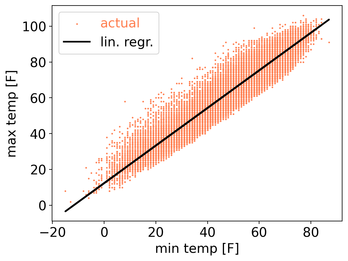
tmax_ls_predic = 12.35 + 1.05 * ds_cp["temp_min"]
plt.scatter(ds_cp["temp_min"], ds_cp["temp_max"], s=1, color="coral", label="actual")
plt.plot(ds_cp["temp_min"], tmax_ls_predic, color="black", linewidth=2, label="lin. regr.")
plt.xlabel("min temp [F]")
plt.ylabel("max temp [F]")
plt.legend(labelcolor="linecolor")
<matplotlib.legend.Legend at 0x1710f2a90>