3. Probability theory#
Warning
Under construction
This notebook comprises various text and code snippets for generating plots and other content for the lectures corresponding to this topic. It is not a coherent set of lecture notes. Students should refer to the actual lecture slides available on Blackboard.
3.1. Intro#
3.1.1. Recap of last time#
In the Introductory lecture, we X
what we’ll covere here: probability theory.
3.1.2. Today: Probability theory#
abc
Before jumping in further, let’s re-load that same dataset, and while we’re at it import the needed packages we’ll need to make nice plots:
import xarray as xr

filepath_in = "../data/central-park-station-data_1869-01-01_2023-09-30.nc"
ds_central_park = xr.open_dataset(filepath_in)
precip_central_park = ds_central_park["precip"]
temp_central_park = ds_central_park["temp_avg"]
Show code cell content
# First, import the matplotlib package that we'll use for plotting.
from matplotlib import pyplot as plt

# Then update the plotting aesthetics using my own custom package named "puffins"
# See: https://github.com/spencerahill/puffins
from puffins import plotting as pplt
plt.rcParams.update(pplt.plt_rc_params_custom)
3.2. The 3 axioms#
Recall the 3 axioms:
Non-negativity: the probability \(P\) of any event \(E\) is at least zero: \(P(E)\geq0\)
X: the probability \(P\) of the sample space \(S\) is unity: \(P(S)=1\).
Additivity: For two mutually exclusive events \(E_1\) and \(E_2\), the probability of their union \(E_1\cup E_2\) is the sum of their individual probabilities: \(P(E_1\cup E_2)=P(E_1)+P(E_2)\)
In class, we used these to formally prove a couple things:
All probabilities are bounded by 0 and 1: for any event \(E\), \(0\leq P(E) \leq 1\).
Probability of the complement: If \(E\) is an event and \(E^C\) is its complement, then \(P(E^C)=1-P(E)\)
Use these to prove the following: \(P((E_1\cup E_2)^C)=1-P(E_1\cup E_2)=1-[P(E_1)+P(E_2)-P(E_1\cap E_2)]\)
3.3. Observations, random variables#
We consider each observation—that is, each inidividual value in any dataset, to be the result of an experiment performed on nature.
A random variable is a function that maps the outcome of any observation to a real number.
3.4. Discrete vs. continuous variables#
A discrete variable is one that can only take on a finite number of values. A continuous variable is one that can take on infinitely many values.
In practice, often physical quantities that are in reality continuous, like temperature, end up as effectively discrete, because they are only reported up to a finite precision. But unless this precision is quite coarse, we can usually still usefully treat them as if they really were continuous.
3.5. Probability distributions#
3.5.1. Probability mass and density functions#
For discrete random variables, the probability mass function specifies the probability of every possible outcome of that variable. For example, the probability mass function of a fair 6-sided dice would be 1/6 for each of the 6 faces, since they’re all equally likely.
Notice in this dice roll case that the probability mass function summed over all possible up to exactly one…that is true for all probability mass functions.
For continuous random variables,
3.5.2. Cumulative distribution functions#
The cumulative distribution function (CDF) of a random variable—whether continuous or discrete—gives the probability for each possible value that the variable is less than or equal to that value. In other words, for each value \(x\), it gives the corresponding quantile. As such, it always ranges from 0 (for values less than the variable’s minimum value, or for \(-\infty\) if there is no minimum value) to 1 (for values greater than the variable’s maximum value, or for \(+\infty\) if there is no maximum value).
For discrete variables, the CDF is the sum of the probability mass function over all values less than or equal to the given value: $\(F(x_j)=\sum_{i=1}^j p(x_i),\)\( where \)x_j\( is the value of interest, \)f(x)\( is the probability mass function, and the values of \)x\( are assumed to be ordered from the smallest value \)x_0\( to their largest value \)x_N$.
For continuous variables, the CDF is the integral of the probability density function: $\(F(x)=P(X\leq x)=\int_{-\infty}^xp(u)\,\mathrm{d}u.\)$
3.5.3. Linking probability mass and density functions to the cumulative distribution function#
import holoviews as hv
import numpy as np
from scipy.stats import norm
import panel as pn
from holoviews import streams

hv.extension('bokeh')

# Function to plot PDF and CDF
def plot_distribution(mean, std_dev):
    x = np.linspace(-10, 10, 400)
    pdf = norm.pdf(x, mean, std_dev)
    cdf = norm.cdf(x, mean, std_dev)

    pdf_curve = hv.Curve((x, pdf), 'X', 'Density').opts(width=400, height=400, line_color='blue')
    cdf_curve = hv.Curve((x, cdf), 'X', 'Cumulative').opts(width=400, height=400, line_color='green')

    return (pdf_curve + cdf_curve)

# Create the Panel widgets
mean_slider = pn.widgets.FloatSlider(name='Mean', start=-5, end=5, value=0)
std_dev_slider = pn.widgets.FloatSlider(name='Standard Deviation', start=0.1, end=5, value=1)

# Create the Holoviews stream
dmap_stream = streams.Params(mean_slider, ['value'], rename={'value': 'mean'})
dmap_stream2 = streams.Params(std_dev_slider, ['value'], rename={'value': 'std_dev'})

# Create the DynamicMap
dmap = hv.DynamicMap(plot_distribution, streams=[dmap_stream, dmap_stream2])

# Layout the Panel
pn.Column(pn.Column("## Normal Distribution", mean_slider, std_dev_slider), dmap).servable()


/Users/sah2249/miniconda3/envs/stat-methods-course/lib/python3.11/site-packages/holoviews/plotting/bokeh/plot.py:987: UserWarning: found multiple competing values for 'toolbar.active_drag' property; using the latest value
  layout_plot = gridplot(
/Users/sah2249/miniconda3/envs/stat-methods-course/lib/python3.11/site-packages/holoviews/plotting/bokeh/plot.py:987: UserWarning: found multiple competing values for 'toolbar.active_scroll' property; using the latest value
  layout_plot = gridplot(
3.6. Expectation and population mean#
Conceptually, expectation (also known as “expected value”) is simply a probability-weighted average over a random variable.
For a discrete variable, this is $\(E[g(X)]=\sum_{i=1}^Ng(X_i)p_i,\)\( where \)g(X)$ is some function.
For a continuous variable, the expectation is $\(E[g(X)]=\int_{-\infty}^{\infty}g(x)p(x)\,\mathrm{d}x.\)$
3.7. Monte Carlo methods#
Monte Carlo methods are statistical analyses based on repeatedly drawing at random from a given distribution, and doing that many times. (The name refers to the Monte Carlo Casino in Monaco, where a relative of one of the scientists in the Manhattan Project liked to gamble.)
3.7.1. Random number generators#
A random number generator is, well, something that generates a random number.
In Python, we can use the various random number generators builtin to numpy. For example, to draw a random number from the standard normal distribution, we use numpy.random.randn. Let’s take a look at its docstring to learn more about it:
import numpy as np

np.random.randn?
According to the docstring, if we pass it no arguments (or the value 1) it gives use one value, and if we give it a scalar it gives us that many values. (And if we give it a list of scalars it returns an array with shape equal to that list, but that’s not relevant here):
print(np.random.randn())
print(np.random.randn(5))
0.7100305803542737
[ 0.14260006  1.49637688 -1.05471838  0.20922212 -1.93897556]
Notice that each time you run these commands, you’ll get a different set of numbers, and it’s impossible to know ahead of time precisely what those will be:
print(np.random.randn())
print(np.random.randn(5))
0.7559606560434529
[ 0.78734158  0.23645519 -1.28356748  0.79717975  0.91979882]
However, these aren’t truly random…in short, the computer has pre-computed many sequences (specifically, \(2^{32}\) of them), of basically random values, and then when you run your code it quasi-randomly picks one of those sequences. (This makes it a pseudorandom number generator.) If we number all those different sequences from 0 to \(2^{32}-1\), that number is called the seed. And you can specify which seed you want using np.random.seed. For example, let’s set the seed to be 42 and then re-run the above code. I am certain that the output will be: 0.4967141530112327 for the first line and [-0.1382643 0.64768854 1.52302986 -0.23415337 -0.23413696] for the second line:
np.random.seed(42)
print(np.random.randn())
print(np.random.randn(5))
0.4967141530112327
[-0.1382643   0.64768854  1.52302986 -0.23415337 -0.23413696]
3.8. Theoretical distributions#
3.8.1. Discrete#
3.8.1.1. Uniform#
3.8.1.2. Binomial#
3.8.2. Continuous#
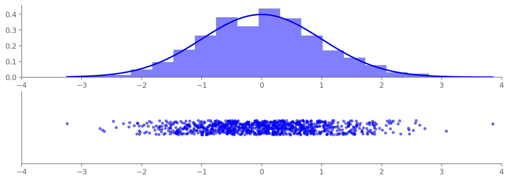
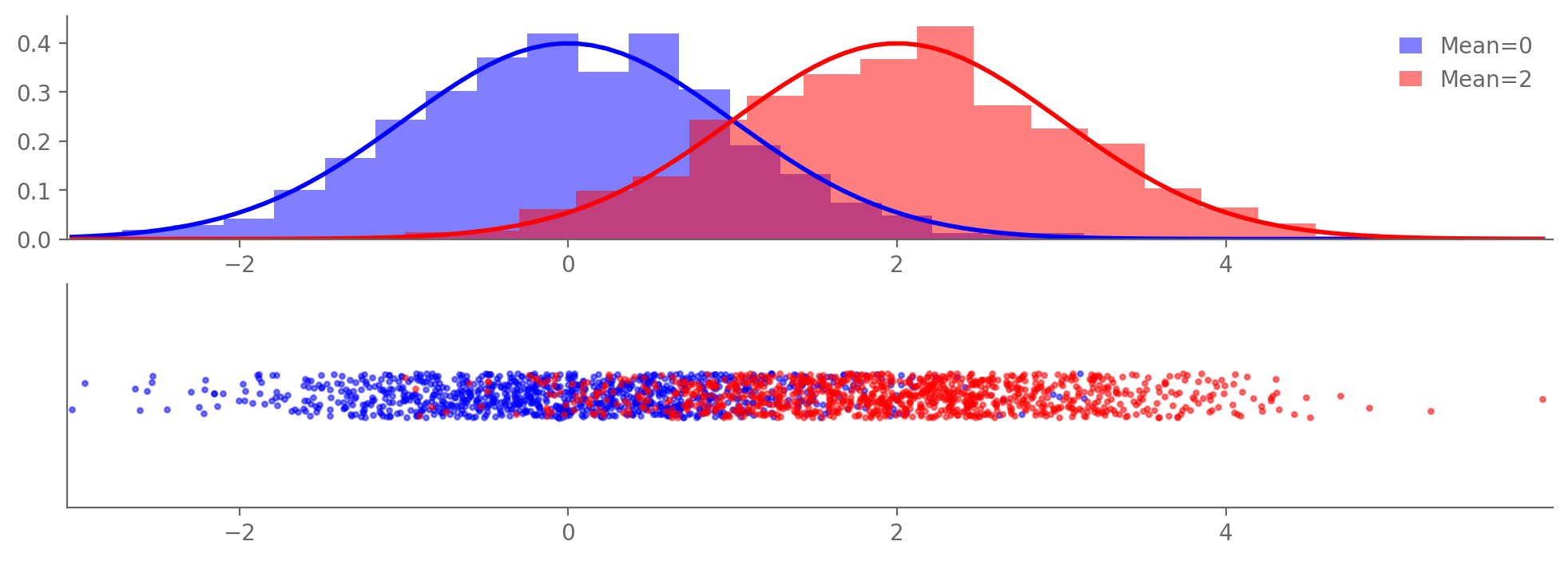
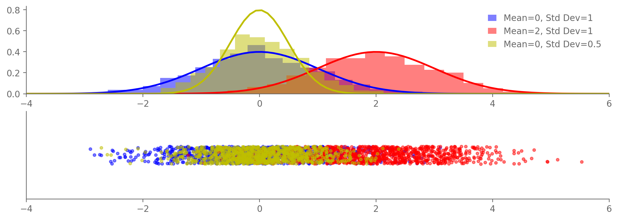
3.8.2.1. Normal (“Gaussian”)#
The normal distribution is crucially important. Its probability density is given by $\(p(x)=\frac{1}{\sqrt{2\pi}}\frac{1}{\sigma}\exp\left(-\frac{(x-\mu)^2}{2\sigma^2}\right),\)$ where
\(\mu\) is the mean
\(\sigma\) is the standard deviation
If \(\mu=0\) and \(\sigma=1\), the resulting distribution is called the standard normal: $\(p(x)=\frac{1}{\sqrt{2\pi}}\exp\left(-\frac{x^2}{2}\right).\)$
import matplotlib.pyplot as plt
import numpy as np
from scipy.stats import norm

N = 1000  # Number of random values
jitter_amount = 0.01  # Amount of jitter

# Draw N random values from a standard normal distribution
samples = np.random.normal(0, 1, N)

# Apply jitter in the y-direction
jitter = np.random.uniform(-jitter_amount, jitter_amount, N)

# Create the plot
fig, (ax1, ax2) = plt.subplots(2, 1, figsize=(12, 4))#, gridspec_kw={'height_ratios': [1, 4]})

# Histogram and PDF
count, bins, _ = ax1.hist(samples, bins=20, density=True, alpha=0.5, color='b')
xmin, xmax = min(samples), max(samples)
x = np.linspace(xmin, xmax, 100)
p = norm.pdf(x, 0, 1)
ax1.plot(x, p, 'b', linewidth=2)

# Scatter plot
ax2.scatter(samples, jitter, color='b', alpha=0.5, s=10)

# Set axis limits and hide y-axis
ax1.set_xlim(-4, 4)
ax2.set_xlim(-4, 4)
ax2.set_ylim(-jitter_amount * 5, jitter_amount * 5)

# Hide y-axis
ax2.set_yticks([])

plt.show()
import matplotlib.pyplot as plt
import numpy as np
from scipy.stats import norm

N = 1000  # Number of random values
jitter_amount = 0.01  # Amount of jitter

# Draw N random values from two different normal distributions
samples1 = np.random.normal(0, 1, N)
samples2 = np.random.normal(2, 1, N)

# Apply jitter in the y-direction
jitter1 = np.random.uniform(-jitter_amount, jitter_amount, N)
jitter2 = np.random.uniform(-jitter_amount, jitter_amount, N)

# Create the plot
fig, (ax1, ax2) = plt.subplots(2, 1, figsize=(12, 4))

# Histogram and PDF for the first normal distribution
count1, bins1, _ = ax1.hist(samples1, bins=20, density=True, alpha=0.5, color='b', label='Mean=0')
xmin, xmax = np.min([samples1, samples2]), np.max([samples1, samples2])
x1 = np.linspace(xmin, xmax, 100)
p1 = norm.pdf(x1, 0, 1)
ax1.plot(x1, p1, 'b', linewidth=2)

# Histogram and PDF for the second normal distribution
count2, bins2, _ = ax1.hist(samples2, bins=20, density=True, alpha=0.5, color='r', label='Mean=2')
x2 = np.linspace(xmin, xmax, 100)
p2 = norm.pdf(x2, 2, 1)
ax1.plot(x2, p2, 'r', linewidth=2)

# Scatter plot for both distributions
ax2.scatter(samples1, jitter1, alpha=0.5, s=5, color='b')
ax2.scatter(samples2, jitter2, alpha=0.5, s=5, color='r')

# Legend and axis settings
ax1.legend()
ax1.set_xlim(1.01*xmin, 1.01*xmax)
ax2.set_xlim(1.01*xmin, 1.01*xmax)
ax2.set_ylim(-jitter_amount * 5, jitter_amount * 5)

# Hide y-axis for the scatter plot
ax2.set_yticks([])

plt.show()
import matplotlib.pyplot as plt
import numpy as np
from scipy.stats import norm

N = 1000  # Number of random values
jitter_amount = 0.01  # Amount of jitter

# Draw N random values from three different normal distributions
samples1 = np.random.normal(0, 1, N)  # Mean 0, std dev 1
samples2 = np.random.normal(2, 1, N)  # Mean 2, std dev 1
samples3 = np.random.normal(0, np.sqrt(0.5), N)  # Mean 0, std dev sqrt(0.5)

# Apply jitter in the y-direction
jitter1 = np.random.uniform(-jitter_amount, jitter_amount, N)
jitter2 = np.random.uniform(-jitter_amount, jitter_amount, N)
jitter3 = np.random.uniform(-jitter_amount, jitter_amount, N)

# Create the plot
fig, (ax1, ax2) = plt.subplots(2, 1, figsize=(12, 4))

# Histogram and PDF for each normal distribution
colors = ['b', 'r', 'y']
means = [0, 2, 0]
std_devs = [1, 1, 0.5]

for i, (color, mean, std_dev, samples) in enumerate(zip(colors, means, std_devs, [samples1, samples2, samples3])):
    ax1.hist(samples, bins=20, density=True, alpha=0.5, color=color, label=f'Mean={mean}, Std Dev={std_dev}')
    x = np.linspace(-4, 6, 100)
    p = norm.pdf(x, mean, std_dev)
    ax1.plot(x, p, color, linewidth=2)

# Scatter plot for all distributions
ax2.scatter(samples1, jitter1, alpha=0.5, s=10, color='b')
ax2.scatter(samples2, jitter2, alpha=0.5, s=10, color='r')
ax2.scatter(samples3, jitter3, alpha=0.5, s=10, color='y')

# Legend and axis settings
ax1.legend()
ax1.set_xlim(-4, 6)
ax2.set_xlim(-4, 6)
ax2.set_ylim(-jitter_amount * 5, jitter_amount * 5)

# Hide y-axis for the scatter plot
ax2.set_yticks([])

plt.show()
import holoviews as hv
import panel as pn
from scipy.stats import norm
import numpy as np

hv.extension('bokeh')

def plot_samples(N=1000, jitter=False):
    # Generate N samples from standard normal
    samples = np.random.normal(0, 1, N)

    # Add jitter if checkbox is selected
    if jitter:
        jitter_amount = 0.01
        jitter_values = np.random.uniform(-jitter_amount, jitter_amount, N)
    else:
        jitter_values = np.zeros(N)

    # Create scatter plot
    scatter = hv.Scatter((samples, jitter_values)).opts(
        width=900,
        height=200,
        size=5,
        alpha=0.5,
        xlim=(-4, 4),
        ylim=(-0.05, 0.05),
        yaxis=None
    )

    # Create histogram and fit normal distribution
    hist = np.histogram(samples, bins=20, density=True)
    x = np.linspace(-4, 4, 100)
    fitted_params = norm.fit(samples)
    pdf_fitted = norm.pdf(x, *fitted_params)

    histogram = hv.Histogram(hist, kdims=['Value']).opts(
        width=900,
        height=200,
        alpha=0.5,
        xlim=(-4, 4)
    )

    fitted_curve = hv.Curve((x, pdf_fitted), kdims=['Value'], vdims=['Density']).opts(
        line_width=2,
        color='red'
    )

    return (histogram * fitted_curve + scatter).cols(1)

# Create widgets
N_slider = pn.widgets.IntSlider(name='N (Number of Points)', start=100, end=5000, step=100, value=1000)
jitter_checkbox = pn.widgets.Checkbox(name='Enable Jitter', value=False)

# Create interactive plot
interactive_plot = pn.interact(plot_samples, N=N_slider, jitter=jitter_checkbox)

# Display the interactive plot
pn.Column("# Interactive Standard Normal Sample Plot", interactive_plot).servable()
/Users/sah2249/miniconda3/envs/stat-methods-course/lib/python3.11/site-packages/holoviews/plotting/bokeh/plot.py:987: UserWarning: found multiple competing values for 'toolbar.active_drag' property; using the latest value
  layout_plot = gridplot(
/Users/sah2249/miniconda3/envs/stat-methods-course/lib/python3.11/site-packages/holoviews/plotting/bokeh/plot.py:987: UserWarning: found multiple competing values for 'toolbar.active_scroll' property; using the latest value
  layout_plot = gridplot(
3.8.3. Other probability distributions#
In class, we covered the uniform, binomial, and normal distributions. There are many other distributions that come up regularly in Earth and Atmospheric Sciences and statistics more generally. These include:
Student’s \(t\) (in tests of differences in means)
Gamma (for precipitation)
Chi-squared (\(\chi^2\); in tests of differences in variance)
Generalized Extreme Value (in block minima and maxima)
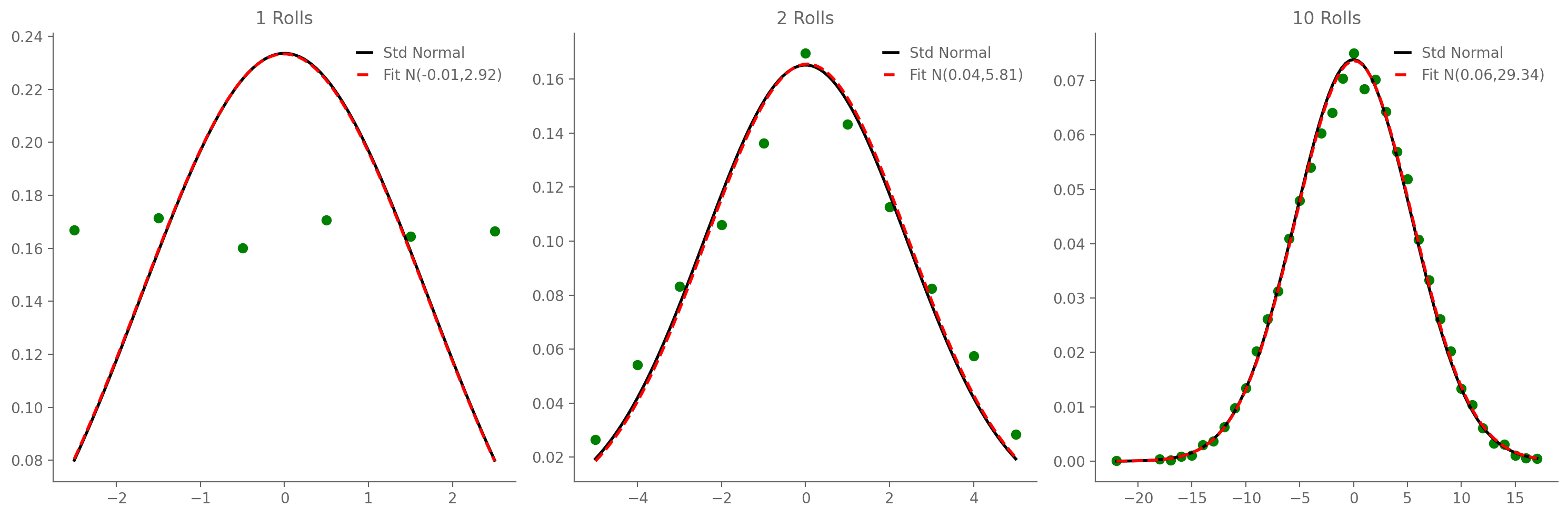
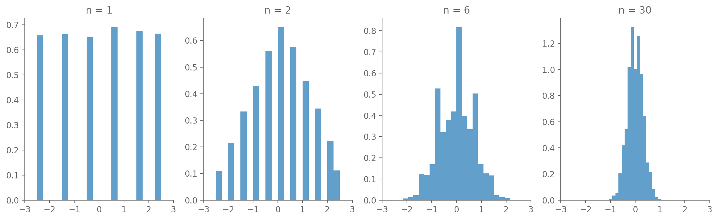
3.9. Central Limit Theorem#
3.9.1. Conceptually#
Conceptually / in essence: the sum of random variables tends to be Gaussian, whether or not the variable themselves are Gaussian.
3.9.2. Formally#
Formally:
Let \(X_1\), …, \(X_N\) be independent and identically distributed (“IID”) random variables, all with identical mean \(\mu_X\) and identical (finite) variance \(\sigma_X\). Note that, while they must be IID, their distribution does not have to be the Gaussian. Then the random variable $\(Z=\frac{\hat\mu_X-\mu_X}{\sigma_X/\sqrt{N}}\)\( converges to the standard normal distribution as \)N\rightarrow\infty$.
3.9.3. Examples#
3.9.3.1. Average of one or more dice rolls#
import numpy as np
import matplotlib.pyplot as plt

# Function to simulate rolling a die
def roll_die(n):
    return np.random.randint(1, 7, n)

# Number of simulations
num_simulations = 10000

# Different numbers of dice to roll
num_dice = [1, 2, 6, 30]

# Initialize the plot
fig, axs = plt.subplots(1, len(num_dice), figsize=(15, 4))

# Loop through each subplot and perform the simulation
for i, n in enumerate(num_dice):
    averages = []
    for _ in range(num_simulations):
        rolls = roll_die(n)
        average = np.mean(rolls)
        averages.append(average)

    # Plotting the histogram
    axs[i].hist(np.array(averages)-3.5, bins=20, density=True, alpha=0.7, label="Sample Average")
    axs[i].set_title(f'n = {n}')
    axs[i].set_xlim([-3, 3])

# Show plot
plt.show()
import numpy as np
import matplotlib.pyplot as plt
from scipy.stats import norm

# Set random seed for reproducibility
np.random.seed(0)

# Number of dice rolls and number of experiments
n_rolls = [1, 2, 10]
n_experiments = 10000

# Create a subplot of 1 row and len(n_rolls) columns
fig, axes = plt.subplots(1, len(n_rolls), figsize=(15, 5))

# Loop over the different number of rolls
for i, rolls in enumerate(n_rolls):
    ax = axes[i]

    # Simulate the sum of `rolls` dice rolls, `n_experiments` times
    total = np.sum(np.random.randint(1, 7, (n_experiments, rolls)), axis=1)

    # Center the data by subtracting 3.5 * rolls (the expectation)
    total_centered = total - 3.5 * rolls

    # Get unique values and their counts
    unique_vals, counts = np.unique(total_centered, return_counts=True)

    # Normalize the counts to get frequencies
    frequencies = counts / np.sum(counts)

    # Scatter plot
    ax.scatter(unique_vals, frequencies, color='g')

    # Overlay a standard normal distribution
    x = np.linspace(min(total_centered), max(total_centered), 100)
    p = norm.pdf(x, 0, np.sqrt(rolls * 35 / 12))
    ax.plot(x, p, 'k', linewidth=2, label='Std Normal')

    # Fit a normal distribution to the data
    mu, std = norm.fit(total_centered)
    p = norm.pdf(x, mu, std)
    ax.plot(x, p, 'r--', linewidth=2, label=f'Fit N({mu:.2f},{std ** 2:.2f})')

    ax.set_title(f'{rolls} Rolls')
    ax.legend()

plt.tight_layout()
plt.show()