Introduction
We learned four key plot types: timeseries, box-and-whisker, histogram, and scatterplot. This included both what they represent/how to interpret them and how to plot them in a Jupyter notebook using matplotlib and numpy. We also learned how to read in netCDF files from disk---such as the Central Park weather station dataset---using the xarray package.
In this assignment, you’ll generate these plots for other variables in that dataset.
A toy example
To provide concrete examples of what you’ll create, first I’ll create a fake dataset that’s the same length as the Central Park data.
(This involves things that we haven’t yet covered in class, so it’s no problem if you don’t follow the lines of code below.)
import numpy as np
import xarray as xr

# Load the Central Park dataset from disk.
# Note: on my computer, the filepath below is the correct one.  But it probably won't be on yours!  Replace it as needed.
filepath_in = "../data/central-park-station-data_1869-01-01_2023-09-30.nc"
ds_central_park = xr.open_dataset(filepath_in)

# Draw randomly from a Gaussian distribution.
mean = 0.
std_dev = 1.
vals_toy = np.random.normal(mean, std_dev, len(ds_central_park["temp_avg"]))

# Make this toy data into an xarray.DataArray with the coordinates from the Central Park data
arr_toy = vals_toy * xr.ones_like(ds_central_park["temp_avg"]).rename("toy")
arr_toyNow, create the plots:
%matplotlib inline
%config InlineBackend.figure_format = "retina"
from matplotlib import pyplot as plt
fig = plt.figure() # create a matplotlib.Figure instance
ax = fig.add_subplot() # add a matplotlib.Axes instance to fig
ax.hist(arr_toy) # you could also call plt.hist
ax.set_xlabel("toy data [unitless]")
ax.set_ylabel("count [unitless]")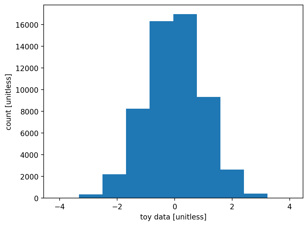
fig, ax = plt.subplots()  # This one-liner is more convenient than the two lines version above.
ax.boxplot(arr_toy)
ax.set_ylabel("toy data [unitless]")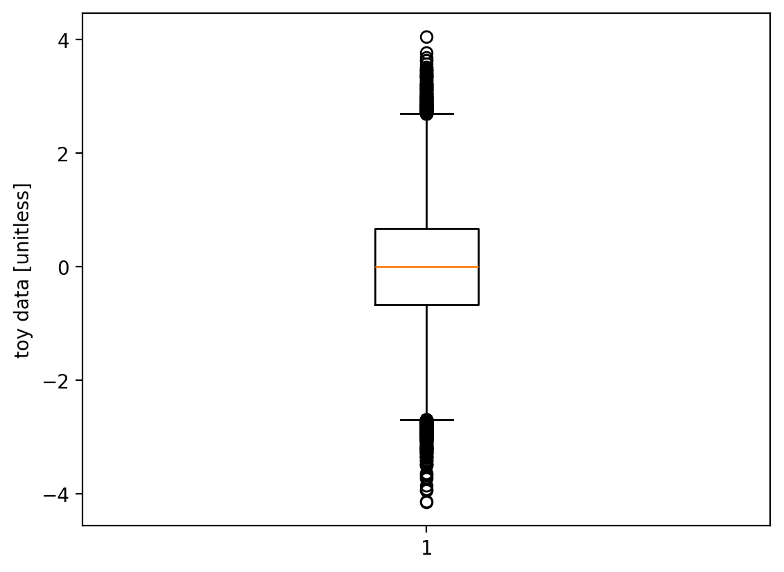
fig, ax = plt.subplots()  # This one-liner is more convenient than the two lines version above.
ax.plot(arr_toy["time"], arr_toy, linewidth=0.5)
ax.set_xlabel("time")
ax.set_ylabel("toy data [unitless]")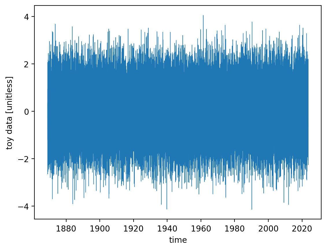
There you go. (We’ll return to scatterplots further below.)
You can also put all three together into a single figure:
fig, axarr = plt.subplots(nrows=1, ncols=3, figsize=(12, 4))  # create a figure containting 1x3 array of axes

ax = axarr[0]
ax.hist(arr_toy)  # you could also call plt.hist
ax.set_xlabel("toy data [unitless]")
ax.set_ylabel("count [unitless]")

ax = axarr[1]
ax.boxplot(arr_toy)
ax.set_xticks([])
ax.set_ylabel("toy data [unitless]")

ax = axarr[2]
ax.plot(arr_toy["time"], arr_toy, linewidth=0.5)
ax.set_xlabel("time")
ax.set_ylabel("toy data [unitless]")

fig.suptitle("Histogram, box-and-whisker, and timeseries plots of the toy array")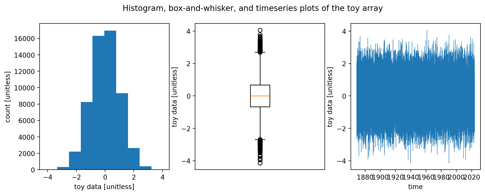
Your specific tasks
Histogram, box-and-whisker, and timeseries for the Central Park weather station variables
For three of the following variables of your choice in the Central Park daily weather dataset...
temp_avg(daily average temperature)temp_min(daily minimum temperature)temp_max(daily maximum temperature)temp_anom(daily average temperature departure from “normal”, i.e. a 30-year average)heat_deg_days(heating degree days)cool_deg_days(cooling degree days)precip(precipitation in inches; when it’s snow this is snow water equivalent)snow_fall(snowfall in inches that day)snow_depth(depth in inches of snow currently on the ground)
...complete all of the following tasks:
Create a 1x3 figure (meaning 1 row by 3 columns) just like the one above generated on my toy array.
Be sure to properly label the x and y axes in each case: identify the physical quantity and the units.
As a text (“markdown”) cell above the figure, include a 1 or 2 sentence description of what the quantity is.
As a Markdown cell below the figure, for each of the 3 plots, include a 1 or 2 sentence description: the overall behavior and anything else that seems noteworthy.
Make selected scatterplots
For each of the following pairs of fields:
temp_minvs.temp_maxtemp_avgvs.cool_deg_dayssnow_fallvs.preciptemp_avgvs.temp_avg2 weeks latertemp_anomvs.temp_anom2 weeks later
...do the following:
generate a scatterplot
Include a markdown cell immediately after with 1-2 sentences describing the overall behavior and anything else noteworthy you see.
How to submit
Submission URLs
Submit via this Google form.
Note: if you submit as a Jupyter Notebook, please submit it as a single .ipynb file with a filename matching exactly the pattern eas42000_hw02_lastname-firstname.ipynb, replacing lastname with your last name and firstname with your first name.
Use a relative path to the netCDF file in your code
Important: you must copy the Central Park dataset netCDF file into the same directory/folder that holds your homework .ipynb file, and your code must refer to that file using a relative rather than absolute filepath. I.e.:
path_to_cp = "./central-park-station-data.nc" # this is good; it will work on my computerNOT the absolute path to where the file lives on your computer:
path_to_cp = "/Users/jane-student/eas4200/central-park-station-data.nc" # this will NOT work on my computerIf you don’t follow this instruction, it will cause your Notebook to not run successfully when I go to run it on my computer.
Your Notebook must run successfully start-to-finish on my laptop
I will run every person’s notebook on my own computer as part of the grading. If that is unsuccessful---meaning that when I select “Run all cells”, the code execution crashes at any point with an error message---you automatically lose 5% on the assignment, and I will email you asking you to re-submit a version that does run. (And each subsequent submission that doesn’t run successfully loses an additional 5%.)
This could be because of the relative/absolute filepath issue described immediately above and/or any other bug in your code.
Why? It takes a lot of time to debug someone else’s Notebook that doesn’t work. And meanwhile, it’s very easy for you to follow this instruction (see bold paragraph immediately below). So it’s just not fair to me if I have to spend a lot of time debugging your code.
To prevent this, as a last step before submitting your Notebook, I URGE you to restart your Jupyter Kernel, select “Run all cells”, and make sure that it runs successfully. Then save it one last time and upload it.
Extra credit
Each extra credit option below (in this case, there’s only one) earns you up to an extra 5% on this assignment.
Submit a 2nd copy of the assignment as the .html output of your notebook or colab
So that I can more quickly review your results, please do the following:
Perform all of your calculations for the extra credit in a separate .ipynb notebook file from the main one that you’ll submit as described above.
Once your Extra Credit notebook is 100% ready, reset and run it start to finish as described above.
At that point, export it to an HTML file using Jupyter’s built-in exporting features.
Upload that HTML file via the same link described above for the main submission.